

Every December, I end up making at least one ornament that is more message than decoration. The sparkle is nice, sure, but what people actually keep is the sentence. Acrylic ornaments are perfect for that because they look clean and modern, and curved text makes even a short phrase feel intentional, like it belongs there.
Below is the exact way I curve comforting words in Cricut Design Space so they hug the shape of an acrylic bauble without turning into a wobbly, hard-to-read arc.
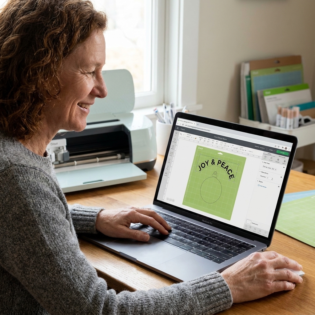
What you need
- Cricut Design Space (desktop is easiest for curving and fine spacing)
- Acrylic ornament blank (round is simplest, but this works for ovals too)
- Permanent adhesive vinyl for long-lasting ornaments, or removable vinyl if you like changing things each year
- Transfer tape (standard grip is usually plenty)
- Weeding tools
- Isopropyl alcohol and a lint-free cloth for prep
- A scraper or an old gift card for burnishing
If you want your comforting words to feel like they were printed on the ornament, not stuck on, the prep step matters. Acrylic holds fingerprints and static like it is its job, so after cleaning, handle the blank by the edges if you can.
Words that curve well
Curving text adds character, but it also introduces distortion. That means some phrases curve beautifully, and some fight you no matter what font you pick.
Phrases that curve well
- Short blessings: “Peace,” “Be still,” “Light returns”
- Gentle reminders: “You are safe,” “Breathe,” “One day at a time”
- Mini dedications: “Always with us,” “Loved beyond words”
Phrases that tend to look awkward
- Anything with lots of tall letters packed together (a line full of t, l, h, k)
- Long phrases that force tiny text
- Very mixed-case scripts where capitals are dramatically taller than lowercase
If you are choosing between two wordings, choose the one with fewer letters. On a curved baseline, breathing room reads as calm.
For more phrase ideas you can adapt for memorial or comfort gifting, you might like these comforting quotes for pet memorial garden stones. Many of them work beautifully on ornaments when shortened.
Curve text in Design Space
1) Measure the safe text zone
Before you open Design Space, measure the area where vinyl can sit without hitting a raised rim, a drilled hole, or a hanger cap. On many acrylic blanks, the true usable circle is slightly smaller than the full diameter.
- Measure the usable width in inches or millimeters.
- Decide where the words will go: top arc, bottom arc, or a full circle.
I like to leave a little empty space above the words so the hook hardware does not visually crowd the message.
2) Add text and choose a font
In Design Space, click Text, type your phrase, then select a font.
- For easy weeding, avoid extremely thin scripts unless you know your cut settings are dialed in.
- If you use a script font, make sure it still has enough thickness to cut cleanly in vinyl.
If your project is specifically about getting cleaner, more reliable letter cuts, start with the fundamentals in my Cricut lettering guide.
3) Adjust Letter Space first
This is the step most people skip, and it is why their curved text looks bunched in the middle. While your text is still straight:
- Select the text.
- Start at 0, then move in tiny steps.
- Adjust Letter Space slightly, often somewhere between -0.05 and 0.10.
My rule: if the phrase is meant to feel soothing, I lean slightly more open. Tight spacing reads urgent.
4) Apply Curve in small increments
With the text selected, click Curve. Move the slider slowly.
- Positive curve arches upward (like a smile).
- Negative curve arches downward (like a bowl).
Do not chase a perfect semicircle on the first pass. Nudge, look, nudge again. Curving exaggerates any unevenness in letter widths, especially in scripts.
5) Size by width
For ornaments, width is the controlling measurement because you are fitting around a circle. Turn on the lock (proportions) and adjust the W value until it fits your safe text zone.
My typical range: for many 3 to 3.5 inch round acrylic ornament blanks, curved phrases often land around 2.2 to 2.8 inches wide, depending on the font and wording. Thicker fonts usually need a little more margin. Treat this as a starting point, not a rule.
6) Make a matching bottom arc (optional)
If you want text on the top and bottom, you can mirror the look without actually flipping the object:
- Duplicate the curved text.
- Change the wording.
- Adjust the curve value in the opposite direction (positive becomes negative).
I like pairing a name or year on the bottom arc with the comforting phrase on the top arc.
7) Weld or Attach
- Weld if your script letters overlap and you want them to cut as one continuous shape.
- Attach if you are keeping letters separate but need to preserve the curved layout on the mat.
If you skip this, Design Space may scatter your letters on the cut screen, and your careful curve will vanish.
Align it on a circle
Design Space does not know the exact geometry of your acrylic blank, so I fake it with a guide shape:
- Add a Circle from Shapes.
- Resize the circle to match your ornament’s usable area.
- If you see an option to set it as a Guide, do that so it will not cut.
- If you do not see Guide on your version, set the circle to Basic Cut and use it only for layout, then hide it or delete it before you click Make It.
- Place your curved text over the circle and adjust until it visually hugs the edge.
This also helps you center the phrase. If you are using a word like “peace” that has an uneven silhouette, centering by eye usually beats centering by bounding box.
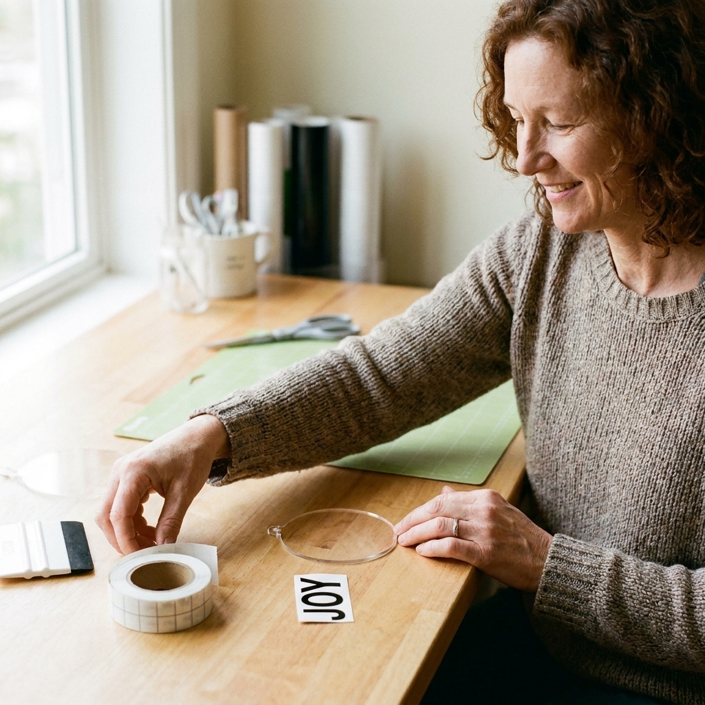
Before you cut
- Make sure your circle guide will not cut: hidden, deleted, or set as a Guide.
- Double-check your mat preview: curved text should stay in its arc (this is where Attach helps).
- Choose the right material setting: small text usually cuts cleaner with a slightly lighter touch than you think.
- Do a tiny test cut if the font is thin or the vinyl is new to you.
- Mirror only when it is truly needed: Mirror is for iron-on (HTV), not adhesive vinyl on acrylic.
Common problems
The middle letters look crowded
- Open Letter Space slightly before curving.
- Try a different font with more consistent letter widths.
- Reduce the curve intensity. A gentler arc often reads more premium.
The first and last letters look like they are tilting
- Increase the text size a bit and reduce curve.
- If using script, consider switching to all caps or small caps for curved layouts.
My script font will not connect after curving
- Adjust Letter Space slightly negative so letters overlap.
- Then Weld.
The vinyl lifts on acrylic
- Clean the acrylic with isopropyl alcohol and let it fully dry.
- Use permanent vinyl and firm burnishing.
- Avoid touching the cleaned surface with your fingers before applying.
Apply vinyl without bubbles
1) Clean first
Wipe the ornament with isopropyl alcohol. Let it air dry. This removes skin oils and helps adhesive grip.
2) Use the hinge method
- Place the vinyl (on transfer tape) where you want it, without sticking it down fully.
- Tape one edge in place with a strip of painter’s tape, like a hinge.
- Lift, peel backing, then lower slowly while burnishing outward from the center.
3) Peel transfer tape slowly
Peel back at a low angle, almost flat against the ornament. If a letter lifts, lay the tape back down and burnish again.
4) Give it time to bond
Permanent vinyl usually grips well right away, but it gets stronger over time. If you can, avoid packaging or stacking ornaments for several hours. A full bond can take a day or longer depending on the vinyl brand and your environment.
Word sets for a curve
If you want your ornament to feel like a tiny keepsake, I like building a set of words rather than cramming one long quote into a tiny space. Here are a few combinations that fit curved layouts well:
- Top arc: “Be still” Bottom arc: “and know”
- Top arc: “Light returns” Bottom arc: “every year”
- Top arc: “Held” Bottom arc: “with love”
- Top arc: “Always with us” Bottom arc: a year or name
If you are the kind of maker who likes to choose words with a little extra intention, you may also enjoy my piece on defining intentionality for creative projects. It applies surprisingly well to gift wording.
Quick FAQ
Can I curve text in the Cricut mobile app?
Mobile support varies by device and app version, and the Curve controls can change with updates. For ornaments, I still reach for desktop because it is the most reliable for Curve plus tiny spacing adjustments.
Should I use Print Then Cut for acrylic ornaments?
For single-color comforting words, cut vinyl is usually cleaner and more durable. Print Then Cut can work for full-color designs, but it tends to look more like a sticker, which may or may not be what you want.
What vinyl color reads best on clear acrylic?
Black, white, gold, and silver are the classics for a reason. If the ornament will sit against dark green branches, white or metallic reads clearly. If it will hang in a window, black is often the sharpest.
Can I sell ornaments with the font I used?
Maybe. Some fonts are free for personal use only, and some allow commercial use. If you plan to sell, check the license for that specific font (even if it is already in your system) before you list anything.