

At one of the little arts festivals I helped run in my twenties, a woodworker friend brought a stack of engraved cutting boards as gifts. People did not just admire the craftsmanship. They leaned in and read. Out loud. The best boards were not the ones with the fanciest borders. They were the ones with a line that sounded like somebody’s real kitchen.
This guide will help you pick a family saying that can hold up as an heirloom, then format it so it engraves clearly, whether you are working with a laser or a wood burner.
Start with the board’s job
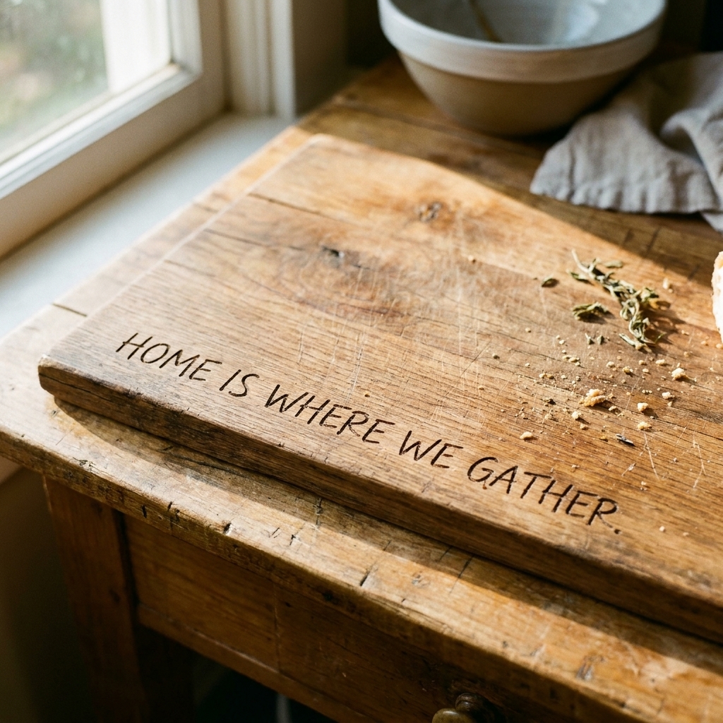
The right saying depends on the board’s job. Is it going to be used every day, brought out for holidays, or hung as decor? That single decision will shape how bold you can be and where the text should live.
- Everyday prep board: Keep the engraving smaller and tucked away from knife-heavy areas. Short is better.
- Serving board: You can center a quote because the board will see less wear from chopping.
- Display keepsake: You can use longer wording, dates, names, and decorative dividers because readability can win over durability.
If your goal is true keepsake feel, it helps to think like an archivist, not a marketer. I wrote more about that mindset in What Makes a Keepsake?.
Choose words that sound like you
The most meaningful engravings usually come from one of three places: a repeated phrase, a shared value, or a memory. Here are practical ways to find a line that is specific enough to feel real, but universal enough to age well.
1) Borrow from real speech
Think of the phrases that get said without anyone noticing. The point is not perfection. The point is recognition.
- “Wash your hands, then help.”
- “Taste first. Then salt.”
- “Coffee first. Questions later.”
- “If you are here, you belong here.”
Tip: If the phrase includes a nickname or in-joke, consider whether it will make sense to future generations. Sometimes you keep the nickname. Sometimes you swap it for a more timeless version and save the nickname for the back.
2) Choose a value, then make it concrete
Values can turn mushy fast on a cutting board. The fix is to anchor the value to an action.
- Value: hospitality → Concrete: “Pull up a chair.”
- Value: gratitude → Concrete: “We say thank you.”
- Value: togetherness → Concrete: “Stay awhile.”
If you are stuck on word choice, my general approach to strong, readable phrasing is in Write Clear Words for a Small Sign. Different surface, same problem.
3) Use a simple kitchen truth
You do not need a famous line. “Kitchen truths” feel traditional without sounding like a poster.
- “Made with love and a little butter.”
- “Where we gather.”
- “Family recipes live here.”
What to avoid
- Overly trendy phrasing that may feel stale in five years.
- Very thin sarcasm if the gift is meant to be sentimental.
- Long quotes that force tiny lettering.
- Lyrics and many modern quotations are copyrighted; very short phrases often are not, but trademarks and licensing can still apply. When in doubt, write your own line.
Length and placement
How long should it be?
For most cutting boards, the sweet spot is:
- 3 to 8 words for a single centered line
- 8 to 16 words for two lines
- Up to about 25 words only if the board is primarily decorative and the text can be comfortably large
If you have a longer family saying you love, consider engraving a shortened front line and moving the rest to the back as a note: “From our kitchen to yours” on the front, and the longer story on the back.
Best placement options
- Bottom third, centered: classic, readable, stays away from handles.
- Along the bottom edge (small): great for everyday boards because knives are less likely to hit the very edge than the center cutting area.
- Top arc near a handle: works well on paddle boards; keeps the quote visible when hung.
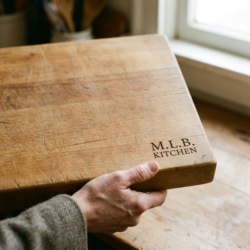
- Corner mark: subtle, modern, and surprisingly elegant for short sayings plus a date.
Food-use note: Engraving can create tiny grooves that hold crumbs and moisture. If the board will actually be used for cutting, many makers engrave the “display side” and use the plain reverse for knife work, or keep the engraving near a handle or outer edge where food contact is minimal.
Quick legibility note: Pale woods often give you the highest contrast after engraving (the burn reads dark). Very busy grain can visually swallow small letters, so go bigger and simpler on woods with dramatic figuring.
Formatting that engraves cleanly
Engraving is unforgiving. Tiny spacing issues that look fine on a screen can blur into a dark patch on wood. These guidelines are meant to keep your text crisp.
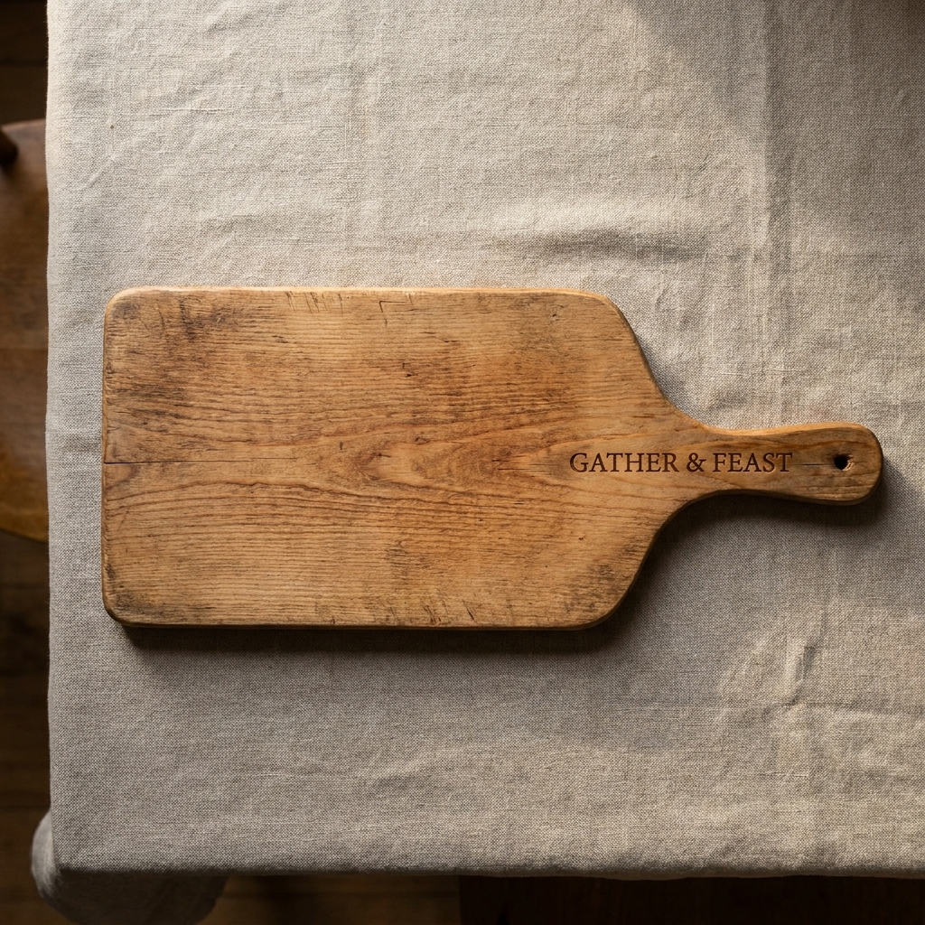
Pick a font with sturdy shapes
- Safest choice: a clean serif or a simple sans-serif with open counters (the inner spaces of letters like O, A, and R).
- Use scripts sparingly: thin strokes and fancy loops can disappear in softer woods or at small sizes.
- Avoid ultra-thin fonts: if you can barely see it on screen, it will be worse on grain.
If you are doing this via a craft cutter first and then burning or etching, you may also like my Cricut lettering guide for ideas on spacing and weeding-friendly type.
Keep letter height readable
Exact sizes vary by machine and wood species, but here are practical starting points:
- Everyday board text: aim for medium-large letters you can read at arm’s length.
- Small “maker’s mark” style text: keep it short and choose a sturdy font, not a delicate script.
- Two-line quotes: do not shrink the font to make it fit. Break the quote differently or choose a shorter line.
Line breaks that look intentional
When you split a saying, break it where a speaker would naturally pause. Avoid leaving “and,” “of,” “to,” or “the” stranded at the beginning or end of a line unless it truly reads well.
- Better:
“In this kitchen
we try again.” - Harder to read:
“In this
kitchen we try again.”
Spacing and alignment rules I trust
- Do not center by eye only. Use your design software’s align tools, then step back and check visually. Wood grain can trick the eye.
- Give your text breathing room. Crowding the edges makes even lovely words feel tense.
- Watch letter spacing in all caps. All caps can engrave beautifully, but some fonts need tracking adjusted so the letters do not kiss.
- Consider a simple divider. A small dot, leaf, or line can separate a name and date without adding clutter.
Layouts that work
Here are a few reliable layouts you can adapt. I am using generic examples so you can plug in your family’s words without forcing the vibe.
Option A: One-line center
- Format: One short line, centered
- Best for: Serving boards, wedding gifts
- Example: “Gather & Eat Well”
Option B: Two-line statement
- Format: Line 1 slightly larger, line 2 slightly smaller
- Best for: Family mottos
- Example:
“COME AS YOU ARE
Stay as long as you like”
Option C: Quote + signature
- Format: Quote in the upper half, then a small line at the bottom
- Best for: Gifts from a specific household
- Example:
“Where there is food, there is love”
“The Martins, 2026”
Option D: Corner engraving
- Format: Small text in a corner, often all caps
- Best for: Everyday boards that will be used hard
- Example: “HOME KITCHEN”
Laser vs. wood burning
If you are laser engraving
- Thin lines can vanish depending on wood species, finish, and engraving depth.
- Small text can fill in depending on settings, resin content, and how much charring spreads into the grain.
- Test on a scrap of the same wood species when possible, or at least the same style board.
If you are wood burning by hand
- Choose a simpler font. Hand-burned scripts can look charming, but they take practice to keep consistent.
- Increase spacing slightly. A tiny wobble is normal; give letters room so wobbles do not merge.
- Favor fewer words. Long quotes increase the chance of uneven line weight and fatigue.
Proofing checklist
I have watched more than one maker realize, too late, that they engraved the wrong year. Here is the checklist I run through, even on simple jobs.
- Read it out loud once, slowly, like you are reading it to a room.
- Check names and dates against a real reference (invitation, family tree note, calendar).
- Confirm apostrophes (The Johnsons vs. Johnson’s). If you want a refresher on tone and intent in sayings generally, this quotes and sayings guide is a good companion.
- Print a paper mockup at full size, cut it out, and lay it on the board.
- Step back 6 feet and see if it reads instantly.
- Check edge distance so the engraving does not land on a curved bevel or too close to a juice groove.
- Decide front vs. back for any extra details (names, date, short dedication).
Saying ideas
Use these as jumping-off points. The best results come from swapping in your family’s real nouns and verbs: the dish you always make, the holiday you host, the habit everyone teases you for.
Warm and welcoming
- “You are always welcome here.”
- “Sit down. Stay awhile.”
- “Come hungry.”
Food-forward and classic
- “Seasoned with love.”
- “Recipe tested. Family approved.”
- “Chop. Stir. Share.”
Funny, not mean
- “Yes, you can have a snack.”
- “If you help cook, you get the first bite.”
- “Made from scratch, mostly.”
Heirloom style
- “Our Family Table”
- “Established 1984”
- “From the Kitchen of the Alvarez Family”
FAQ
Should I use punctuation?
Use punctuation when it improves clarity, especially apostrophes and commas. For very short sayings, you can remove punctuation for a cleaner look, but do not remove it if it changes meaning.
Is all caps easier to engrave?
Often yes, because letterforms are simpler and more uniform. Just watch spacing. Some all-caps fonts need a bit more tracking so the engraving stays crisp.
Where should I put names and dates?
On an everyday cutting board, I like names and dates on the back, or small on the front edge. On a display or serving board, a small second line under the quote looks balanced.
How do I keep the engraving from competing with the grain?
Choose a font with sturdy strokes, avoid ultra-thin scripts, and keep the layout simple. High-grain woods can visually “texture” small letters. Bigger type with more spacing holds its shape.
A final test
Before you engrave, picture someone ten years from now picking up the board. If the words would make them smile without any explanation from you, you have found the right line.
And if you are still torn between two options, choose the one that sounds like it could only come from your kitchen. Trends fade. Familiar voices do not.