
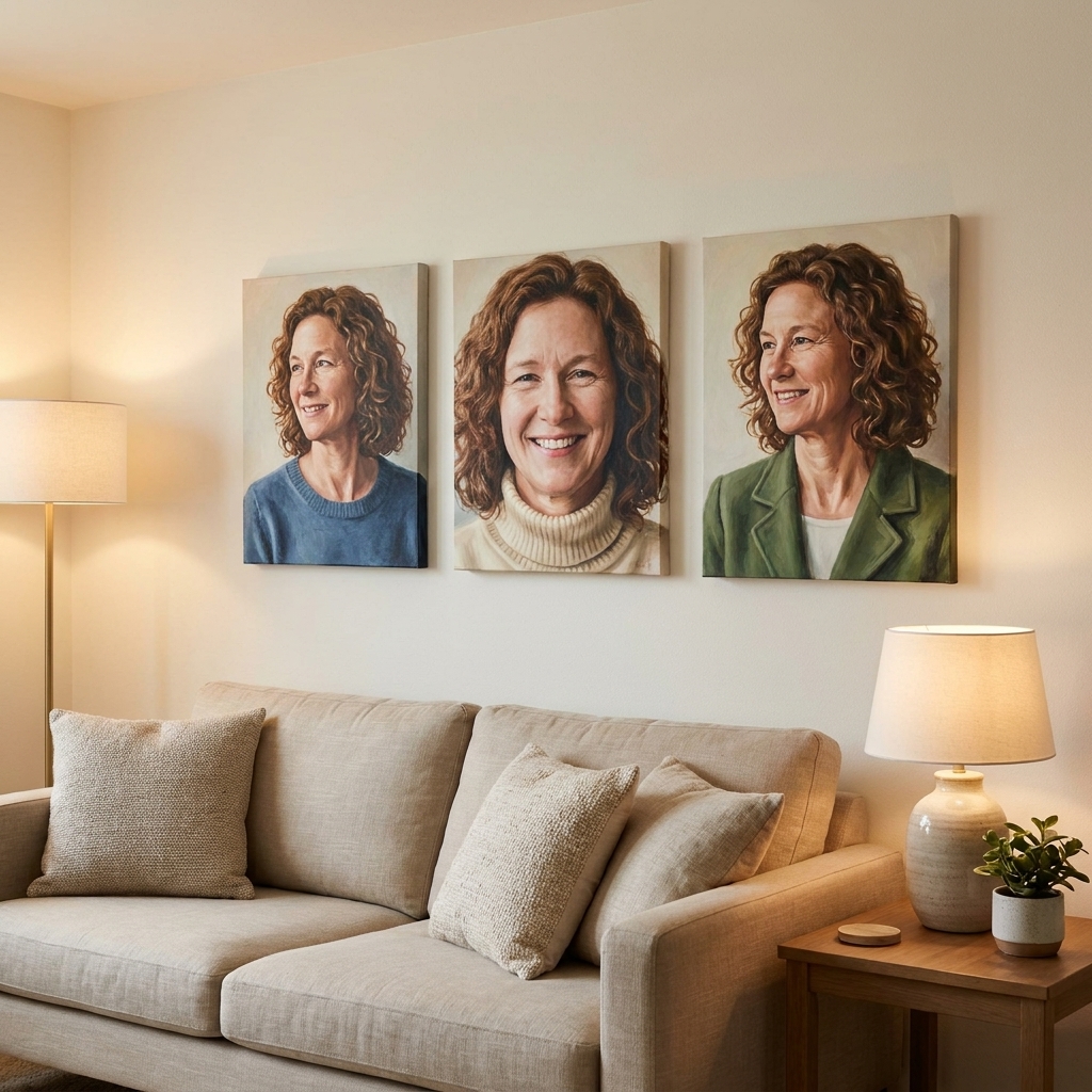
I have a soft spot for triptychs because they make words feel like part of the room, not just something printed on top of it. But splitting a quote across three canvases can go sideways fast: awkward breaks, uneven “weight,” or a middle panel that feels like it is carrying the whole sentence alone.
This guide is how I plan a three-panel quote so it reads smoothly, looks intentional, and still feels like the quote is the main character.
Start with the quote
Before you measure anything, decide what kind of text you are working with. A poem behaves differently than a punchy one-liner.
- Short quote (under about 12 words): As a starting point, these often look best with one focal panel and two supporting panels.
- Medium quote (about 12 to 25 words): Often splits cleanly into three balanced phrases.
- Long quote or poem (25+ words): You are designing pacing. You will need consistent line lengths and very deliberate breaks.
If you are still picking words, it can help to browse how phrases behave on physical projects in our Quotes and Sayings guide. Even when the examples are for other crafts, the same readability rules apply.
Order, rhythm, balance
1) Make the reading order obvious
In most English-language wall art, a triptych reads left to right. Make that effortless by:
- Keeping each panel upright with the same orientation and margins.
- Avoiding layouts where the center panel could be read first (for example, a much larger word in the middle).
- Using consistent baseline alignment if you are doing single lines per panel.
2) Break on meaning, not on word count
My rule: never split a thought in a way that changes how it is understood. Break at natural pauses:
- after punctuation (comma, semicolon, period)
- between clauses
- between image-rich phrases in poetry
Avoid breaking:
- between an article and noun (“the | garden”)
- between a preposition and its object (“in | the quiet”)
- between an adjective and noun (“wild | heart”)
- between a verb and its object (“carry | you”)
3) Balance visual weight
Two panels can have the same number of words and still look uneven. Visual weight comes from:
- Word length: “strength” visually weighs more than “joy.”
- Capital letters: all caps feel heavier.
- Font style: bold or condensed fonts pack density.
- Line count: a two-line panel can outweigh a one-line panel even with fewer words.
Three ways to split
Method A: One phrase per canvas
This is the cleanest approach for most rooms. You divide the quote into three meaningful phrases, each one able to stand on its own without feeling cut off.
Best for: mottos, vows, simple encouragement quotes.
Typography tip: Keep font size consistent across all three. Let spacing do the work.
Method B: Middle as the anchor
If the quote has a spine word or phrase, give it the middle panel and treat the side panels like supporting clauses.
- Left panel sets up.
- Middle panel delivers the theme.
- Right panel resolves.
Best for: quotes with a standout keyword (home, love, courage, together, always).
Watch for: making the center panel so dominant that the triptych stops feeling cohesive. A gentle size increase is usually enough.
Method C: Continuous stanza
This is where you deliberately carry line breaks across canvases, like a book spread. It can be gorgeous, but it demands consistency.
Best for: poems, longer passages, lyrical text.
Must-do: Use the same left margin and the same line spacing on all panels so the reader’s eye glides across.
Type that reads
Pick a font that holds up at distance
Painted text and hand lettering have natural texture. That texture is lovely up close, but it can soften from typical viewing distances (about 8 to 12 feet in many living rooms), especially with low contrast or thin strokes. In general:
- Serif fonts: feel literary and warm, but choose one with sturdy serifs (not hairline-thin).
- Sans-serif fonts: read cleanly at distance and feel modern.
- Script fonts: use sparingly. They are best for one or two key words, not a whole triptych.
Use one simple type system
Even handmade triptychs benefit from a system. For example:
- Primary line: bold serif
- Secondary line: lighter sans-serif
- Accent word: script (once, maybe twice)
If you need help thinking through lettering choices and spacing, our Cricut lettering guide covers readability and layout concepts that translate well to painted letters too.
Give your words room
A common triptych mistake is letting text drift too close to the edges, especially on the outer panels. As a baseline, aim for about 10 to 15 percent of the canvas width as left and right margin, then adjust based on your font and how tight the wording feels.
- Keep the top margin slightly larger than the bottom if you want an airy, gallery feel.
Loosen line spacing
On walls, tight leading (line spacing) makes text feel cramped. Slightly increased line spacing reads calmer and more intentional, especially with poems.
Size for the room
If you only take one sizing note from me, let it be this: wall text needs to be bigger than you think.
- Start with your viewing spot: stand where you will actually sit most often (sofa, bed, dining chair).
- Mock up letter height: use painter’s tape to make a few capital-letter shapes (2 inches, 3 inches, 4 inches) and see what reads quickly without squinting.
- Prioritize stroke width: thin scripts and ultra-light fonts disappear sooner than chunky lettering, even at the same height.
This is also where contrast matters: dark text on a light background reads larger than it is, and tone-on-tone reads smaller.
Plan before you paint
Step 1: Mark natural pauses
Copy the quote exactly. Then mark punctuation and natural spoken pauses. Those marks are your best candidates for panel breaks.
Step 2: Use three buckets
Make three columns on paper: left, center, right. Put your first-draft splits into the columns, then check:
- Does each panel contain a complete thought or a satisfying fragment?
- Is any panel dramatically longer or visually denser?
- Do you have an awkward orphan word (a single tiny word stranded on its own line)?
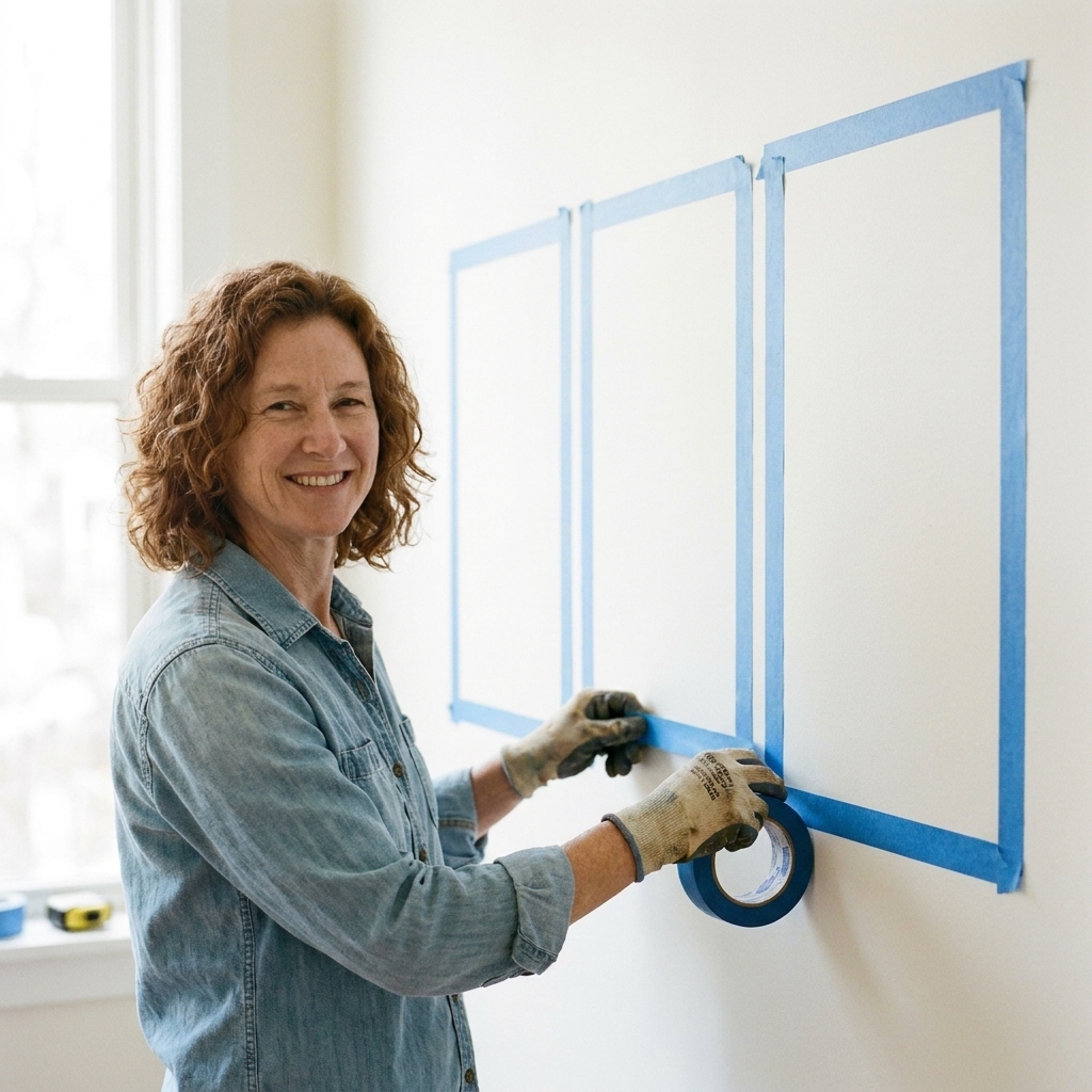
Step 3: Tape a mockup on the wall
This step saves so much regret. Put painter’s tape on the wall to represent each canvas. Stand back where you usually sit. Ask:
- Can I read it quickly?
- Do the gaps between canvases interrupt the sentence?
- Is the center panel at a comfortable eye level?
Hang with intention
Hanging is part of the typography. A perfect split can still feel off if the panels fight each other on the wall.
- Pick one alignment rule: top edges aligned is the easiest, calmest look for most spaces. Centerline alignment can work too, but it has to be consistent.
- Keep spacing identical: measure the gaps, do not eyeball them.
- Check level twice: a slight tilt reads like the sentence is slipping downhill.
Spacing between canvases
The gap between panels is part of the typography. It acts like a pause.
- Tighter gaps make the quote feel like one continuous piece of text.
- Wider gaps make each panel feel more independent and can slow reading.
If your quote is meant to read like a single sentence, keep spacing consistent and modest. If it is three standalone phrases, you can go a touch wider without confusing the eye.
A worked example
Here is a simple, original line I use when I am sketching layouts:
Quote: “Grow slowly, bloom anyway, return to the light.”
Option 1: Clean phrase split
- Left: Grow slowly,
- Center: bloom anyway,
- Right: return to the light.
Why it works: each panel is a complete action, punctuation supports the breaks, and the visual weight is similar.
Option 2: Middle anchor
- Left: Grow slowly
- Center: BLOOM
- Right: return to the light
Why it can work: the keyword in the center earns the emphasis. The fix is to keep the side panels strong (not tiny) so the set still feels like one thought.
Option 3: A break that sounds wrong
- Left: Grow slowly, bloom
- Center: anyway, return
- Right: to the light.
Why it fails: you are breaking inside verbs and inside the natural cadence. The reader has to reassemble the sentence while their eyes jump the canvas gaps.
Bad breaks and fixes
Bad: Breaking a phrase unnaturally
Instead of: “We find | peace in | small things”
Try: “We find peace | in small things | every day” only if you are free-writing the quote or have permission to adapt it. If you are using a fixed quotation, keep the wording and solve it with layout: use two canvases for the sentence and make the third an intentional companion panel (a date, a place name, initials, or a small repeated motif).
Bad: The center panel feels like leftovers
Instead of: “Let your heart | be | brave”
Try: “Let your heart | be brave | and keep going” (again, only if you are allowed to adapt), or use the center as the anchor: “BE BRAVE” in the middle, with the setup and resolution on the sides.
Bad: One panel turns into a paragraph
Fix: Reduce words per panel or increase canvas size, but also consider turning the long quote into a stanza layout (Method C) so line lengths stay consistent.
Make it cohesive
- Repeat one motif: a simple border, a subtle painted wash, or a small icon that appears on all three panels.
- Use one alignment choice: all centered, all left-aligned, or all right-aligned. Mixing alignments often looks like a mistake unless you are very experienced.
- Limit your palette: one text color and one background family reads calm and intentional.
- Keep the finish consistent: all matte or all satin. Mixed sheen can make one panel look louder.
If your triptych is going into a space where clarity matters more than artistry, I also recommend reading how to write clear words for a small sign. The principles are surprisingly similar: short lines, simple hierarchy, and ruthless readability.
Quick checklist
- Panels read left to right with no ambiguity.
- Breaks land on meaning and natural pauses.
- No lonely orphan word sits by itself unless it is intentionally emphasized.
- Margins match across all three canvases.
- Font choices are readable from where you will actually view the art.
- Spacing between canvases supports the rhythm of the quote.
- Panels are hung level, evenly spaced, and aligned with intention.
- You like it both up close and from across the room.
Common questions
Should each canvas have punctuation?
Usually, treat the triptych like one piece of writing. Keep punctuation where it belongs in the sentence, even if it lands at the end of a panel. Just avoid a panel that ends with a dangling hyphen or an ellipsis unless that pause is truly the point.
Can I split a single word across canvases?
I would not, unless you are making experimental typography art. For home decor, it tends to read as a printing error.
Centered or left-aligned text?
Centered feels formal, calm, and symmetrical. Left-aligned feels modern and literary, especially for poems. Either is fine, but pick one and stay consistent across all three panels.
What if the quote is still too long?
Two options that keep the integrity of the piece: shorten the quote (with permission if needed) or increase canvas size. If you cannot do either, shift to a continuous stanza layout and reduce font size carefully, prioritizing readability.