

I have a soft spot for dining room signs, especially the big rustic ones that feel like they have been there forever. A dining room is not just where food lands. It is where the day gets translated into stories, where someone quietly notices you went back for seconds, where the awkward silences eventually turn into inside jokes.
If you are making a farmhouse-style dining area sign and you want the words to feel welcoming instead of cheesy, the secret is choosing language that sounds like real life: simple, inviting, and specific enough to mean something.
How to pick the right message
Before you fall in love with a quote, decide what you want the sign to do in the room. Here are a few quick filters I use when I am helping makers tighten up wording.
Choose your vibe
- Welcoming: open door, extra chair, everyone belongs.
- Grateful: daily bread, simple gifts, thankfulness.
- Playful: seconds, dessert-first rule, friendly teasing.
- Classic: timeless gather language, heirloom tone.
- Quiet: fewer lines, more breath, softer presence.
Match the length to the wall
Large signs can carry longer phrases, but readability still matters. If the sign is high on the wall or viewed from across the room, go shorter and bolder.
As a rule of thumb: aim for 2 to 4 words if it is meant to be read across the room, and 5 to 10 words if it is closer to the table or on a buffet wall.
If you want help keeping your message clear at a glance, my go-to checklist is in Write Clear Words for a Small Sign. The principles apply to big signs too.
Placement changes the tone
Where the sign lives matters more than people think.
- Above a buffet or sideboard: slightly more formal lines feel right, especially if the sign is flanked by nicer serving pieces.
- Near the table: go human and direct. These are the words people read while they are sitting down and passing dishes.
- In an eat-in kitchen: playful usually lands better, because that space already has motion and noise built in.
- In a separate dining room: classic or grateful wording tends to feel like it belongs, even when the room is not used daily.
Single words for an open table
One word can hold a whole habit. These work beautifully centered on a big plank sign, especially in a strong serif or a hand-painted block style.
- Gather
- Welcome
- Together
- Home
- Belong
- Nourish
- Share
- Feast
- Abide (a little old-soul, and quietly faith-leaning)
- Grateful
- Enough
- Come In (two short words, same punch)
If you like the belonging direction, you might also enjoy 12 Words That Mean Home and Belonging.
Short rustic phrases
These are designed to be easy to read and easy to live with. They fit well on horizontal boards, framed canvas, or painted shiplap-style panels.
- Come as you are
- Stay awhile
- Pull up a chair
- There is always room
- Food tastes better together
- Make room for more
- Good food, good company
- Eat, linger, repeat
- Gather here
- Meet me at the table
- Pass the bread
- Come hungry
- Leave a little longer (for the lingerers)
- Plates full, hearts open
- Stay for the stories
- Love lives here
Gather quotes
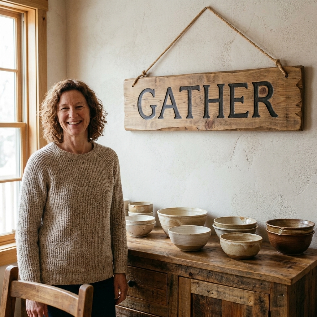
Gather is popular because it is true. The trick is giving it a little context so it feels like your home, not a showroom.
- Gather, then give thanks
- Gather and be glad
- Gather often
- Gather for good
- Gather in grace
- Gather in love
- Gather, eat, tell stories
- Gather where you are loved
- Gather around the table
- Gather here, grow closer
- Gather, we have plenty
- Gather and linger
If you want more help brainstorming sign-friendly formats, my roundup page Guide: Sign Ideas is a good place to wander.
Family meal sayings
These are for the households where meals are equal parts nourishment and noise. They look especially good on large signs because the cadence feels like a familiar refrain.
- This is our happy place
- In this house, we eat together
- Family, food, and laughter
- Where family meets
- Where love is served daily
- May our table always be full
- Come hungry, leave happy
- Built on love and casseroles
- The best memories are made here
- Good days start with coffee and end with dinner
- Talk less, taste more (gentle, not bossy)
- We save a seat
- The table keeps our stories
- Seconds mean you are loved
For more family-forward wording, you may also like Family Sayings for Engraved Cutting Boards. Many of those lines translate beautifully to wall signs.
Hospitality quotes
These are for the people who keep extra pasta on hand, who send leftovers home in mismatched containers, who somehow make one more chair appear.
- Enter as guests, leave as friends
- Our door is open
- Make yourself at home
- All are welcome at our table
- Welcome to our table
- Here, you are family
- Come in, sit down, be fed
- Hospitality over perfection
- Messy table, full heart
- Bring your stories
- If you are here, you belong
- Stay, we will figure it out (for the real-life hosts)
- We will stretch the meal
- More chairs than plans
Playful rustic lines
Farmhouse style does not have to mean solemn. If your kitchen is where the jokes live, let the sign nod at it.
- Dinner is better with seconds
- Save room for dessert
- Powered by leftovers
- Eat first, talk later
- Good food, better gossip (only if it fits your family humor)
- Kitchen closed, love open
- Pass the potatoes
- More pasta, less drama
- If you brought food, you are my favorite
- In case of awkward, offer bread
- Ask for seconds. Always.
Faith-leaning options
If faith is part of your home language, these lean classic and reverent while still fitting a rustic dining room.
- Give us this day our daily bread (from the Lord’s Prayer)
- Let gratitude be our prayer
- Grateful hearts gather here
- Bless the food before us
- Grace before meals
- May this table be a place of blessing
- Give thanks, then pass the plates (a little lighter, still sincere)
One tip: if your sign is going where guests will see it first, choose wording that feels like an invitation instead of a boundary. Grateful hearts gather here tends to land softer than anything that sounds like instructions.
Personal touches
Personal details can make a sign feel like an heirloom, or like a novelty gift. My rule is simple: keep personalization quiet and let the main line do the talking.
- Your family name + Table (best when it is small under the main phrase)
- Est. 2014 (nice for newlyweds, or a new house reset)
- Sunday supper (if that is truly your rhythm)
- Come hungry + a tiny family name beneath it
- Meet me at the table + a subtle street name or town
If you feel yourself adding too many details, stop one step sooner. The most meaningful signs usually read like something you would actually say out loud.
Mini formulas
If none of the quotes fit quite right, build your own from a simple pattern. I do this all the time when I want something that feels personal but still clean on a sign.
Formula 1: Verb + place
- Gather + here
- Share + the table
- Welcome + home
Formula 2: Two nouns + and
- Food and laughter
- Family and friends
- Grace and gratitude
Formula 3: Where + what happens
- Where stories are shared
- Where love is served
- Where we come together
If you want your sign to feel especially intentional, it helps to decide what you want the room to stand for. I wrote more about that mindset in Defining Intentionality for Journal and Bookbinding Projects. Different medium, same heart.
Quick layout tips
Make one line the star
If you are stacking text, choose one anchor phrase and give it the visual spotlight. For example: big GATHER with smaller and be glad beneath it.
Do not let scripts do all the work
Script fonts are gorgeous, but they get hard to read quickly. If your quote is longer than about five words, consider a readable serif for most of the text and reserve script for one emphasis word.
If you are mixing fonts in Cricut Design Space, I have a practical walkthrough in Pairing Script and Serif Fonts. The same pairing logic works for dining room signs.
Build contrast on purpose
Rustic finishes can swallow your lettering if you are not careful. If your board is a dark stain, skip dark paint and go lighter, or use a raw wood background with a deeper letter color. Matte finishes usually photograph and read better than glossy ones, which can throw glare under pendant lights.
Choose your level of rustic
A little distressing can feel charming. Too much can make the message hard to read. When in doubt, keep the letters crisp and let the wood grain or background do the rustic work.
My final favorites
- Pull up a chair (simple, human, hospitable)
- Gather, eat, tell stories (specific and true)
- Messy table, full heart (real life, not staged life)
- Stay for the stories (a little different, still timeless)
Whatever you choose, the goal is not to sound impressive. It is to sound like you. The best dining room sign is the one that feels like it has been quietly telling the truth about your home for years.