

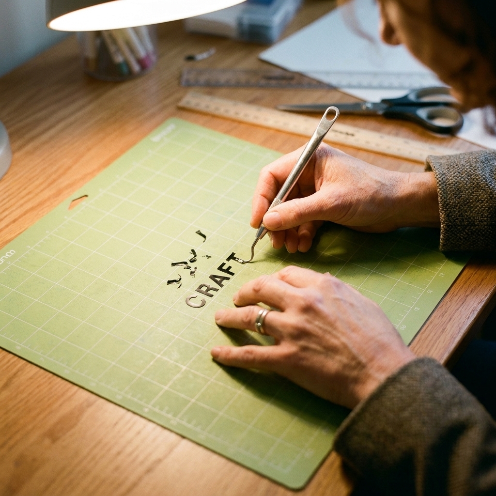
The first time I tried to weed coordinates for a keychain, I picked a font that looked charming on-screen and instantly regretted it. A tiny minus sign disappeared, a decimal point clung to my fingertip like glitter, and by the end I was squinting so hard I felt like I was taking a pop quiz.
The good news is that tiny lettering is not magic, it is a system. Once you set your design up to be weed-friendly and you learn a few “slow hands, bright light” habits, you can make acrylic keychains that quietly say something big: this exact place mattered.
Why coordinates feel so meaningful on a keychain
Coordinates have a special advantage over most short phrases: they are both precise and private. To you (or the person you are gifting), they can mean “where we met,” “our first apartment,” “the trailhead,” “home,” or “the hospital where everything changed.” To everyone else, they just look clean and modern.
If you want to nudge the message a little more toward warmth, pair coordinates with one extra word or a short date. I love simple pairings like:
- HOME + coordinates
- EST. + year
- meet me here + coordinates
- always + a meaningful date
If you enjoy the language side of keepsakes, you might also like What Makes a Keepsake? for ideas on how small details carry emotional weight.
Design choices that make tiny weeding easier
Before we get into tools and technique, let’s make sure your file is not working against you. Most miniature weeding problems are actually design problems.
Pick a font that stays open at small sizes
For coordinates, you want characters with clear counters (the “holes” inside numbers and letters) and sturdy strokes.
- Safer picks: clean sans serifs, simple serifs with moderate contrast, and “single-line look” fonts that are actually cut as outlines.
- Trickier picks: ultra-thin scripts, distressed textures, and fonts where the 1 and l look identical.
One quick clarification that saves frustration: most fonts you see labeled “single-line” still cut as an outline on a Cricut, not a true single stroke. That outline can get fussy when it shrinks.
As a rule, if you have to zoom to 300% just to tell a 3 from an 8, the cutter will struggle too.
Give your characters room to breathe
For coordinate strings, slightly increased letter spacing can be the difference between “relaxing to weed” and “one wrong tug ruins the line.”
- Increase spacing around minus signs, decimal points, and degree symbols if you use them.
- Avoid stacking two lines so tightly that the top line’s descenders (like the tail on a 9) nearly touch the bottom line.
Simplify the coordinate format
Choose a format that reads well at keychain scale, then stick with it (mixing formats is where mistakes sneak in).
- Decimal degrees: 40.74844, -73.98566 (cleanest for tiny cuts)
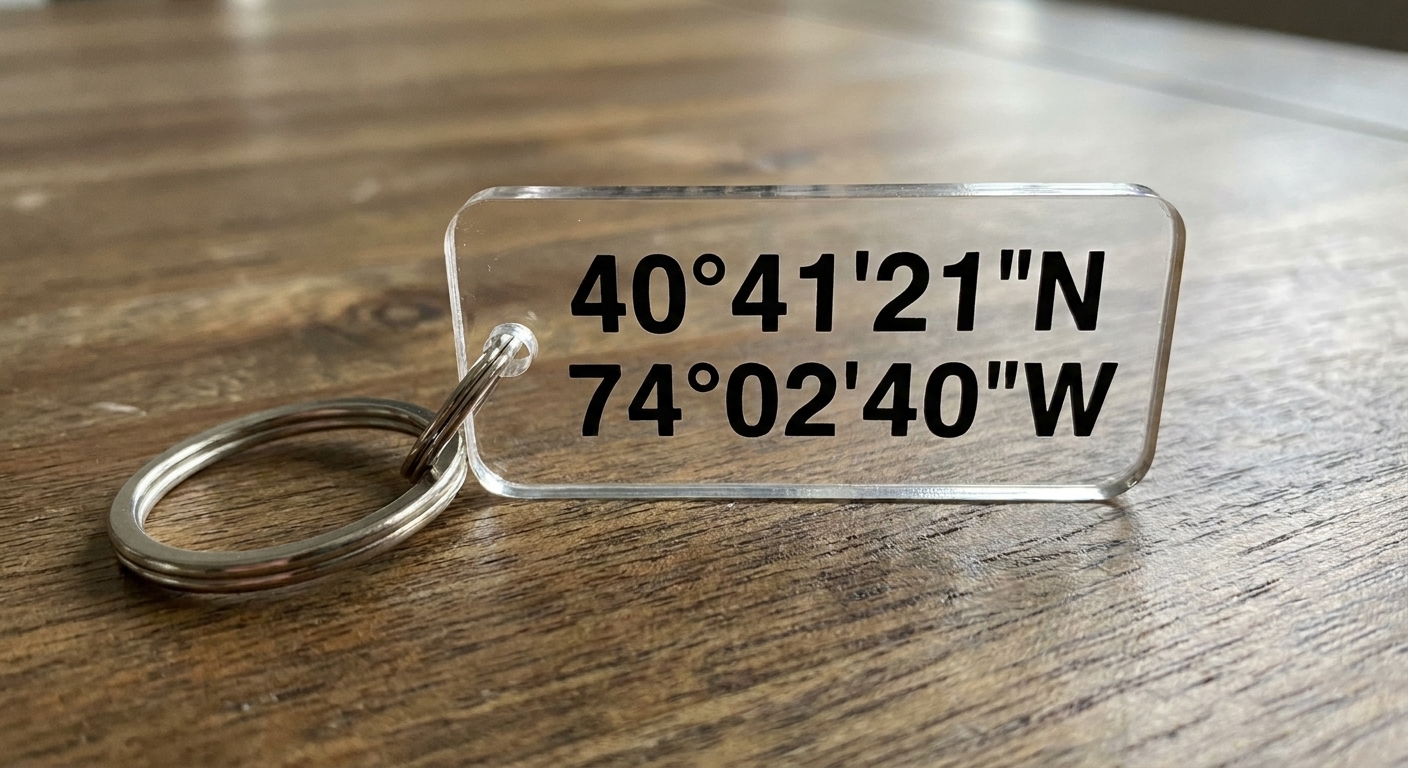
- Degrees, minutes, seconds: 40° 44' 54.4" N (beautiful, but the symbols get tiny fast)
If your heart is set on degrees and seconds, consider making the symbols slightly larger than the numbers, or cutting them from a separate piece of vinyl so they are less fussy to weed.
Add an offset “sticker” border when needed
If you are consistently losing dots or commas, an offset can help: add a very small outline around the whole coordinate line so the little pieces are anchored together. It changes the look slightly, but it can dramatically improve durability and sanity.
For more general Cricut lettering setup tips, Guide: Cricut Lettering is a helpful companion.
Materials and tools that actually help
You do not need a whole craft room. You do need the right few items for small work.
My short list for tiny vinyl weeding
- Bright, direct light: a desk lamp you can aim low across the vinyl helps you see cut lines.
- Fine-tip weeding tool or needle tool: great for lifting the centers of 0, 6, 8, 9 and grabbing micro-punctuation.
- Pointed tweezers: for pulling slivers cleanly without stretching them.
- Precision craft knife: optional, but handy for “surgery” when a cut did not separate. The benefit is a very sharp, controllable tip.
- Transfer tape: choose based on vinyl finish; too-sticky tape can distort tiny characters. Clear tape helps with placement. Paper tape is often less grabby and can be gentler on delicate text.
- Brayer or scraper: for burnishing in controlled, even passes.
Vinyl choice matters more than people admit
If you are new to miniature text, start with a quality permanent adhesive vinyl that weeds cleanly. Glitter, holographic, and some specialty finishes can be thicker and slightly more stubborn for micro-cuts. You can absolutely use them later, just do not make your first coordinate attempt extra hard.
Cut settings for tiny letters
Clean weeding starts at the cut. Your goal is a cut that is deep enough to separate vinyl cleanly, but not so deep that it slices your backing paper into confetti.
Small-text cutting checklist
- Use a sharp blade. Tiny text exposes dull blades immediately.
- Clean your mat. Lint and fibers can keep small pieces from lifting evenly.
- Do a small test cut. If the centers of letters are tearing, you likely need a cleaner cut or a different font size.
- Consider “More” pressure carefully. More pressure can help, but too much pressure can make weeding worse if it causes the backing to cut.
Size guidance that tends to behave
Every machine and vinyl brand varies, but as a starting point: coordinate characters around 0.25 in to 0.35 in tall (measured by the tallest numerals or capitals) are usually manageable to weed and still readable on an average acrylic keychain blank. Smaller is possible, it just becomes a higher-skill cut and a higher-stress weed.
How to weed tiny letters
When you weed miniature letters, the biggest enemy is speed. The second biggest enemy is grabbing the wrong layer. Here is the method I fall back on when I want a clean result.
Step 1: “Crack” the cut lines
Before you lift anything, gently bend the vinyl and backing together in a few directions. You are not creasing it sharply, you are just helping the cut lines reveal themselves. Under angled light, those cut lines become much easier to see.
Step 2: Weed the big negative space first
Start by removing the largest surrounding vinyl (the outside area). Pull it back slowly at a low angle, almost parallel to the surface. If any tiny character starts lifting, pause and press it back down before continuing.
Step 3: Save the tiny interior pieces for last
Now remove the centers of letters and numbers. A few habits help here:
- Use the lightest possible touch with your hook, more like lifting than stabbing.
- Lift interiors by catching an edge, then switch to tweezers if it wants to stretch.
- Work in a consistent order (left to right) so you do not miss a single 0 or 8.
Step 4: Hunt punctuation deliberately
Decimal points and commas love to hide. I like to do a “punctuation pass” at the end: scan for dots, commas, degree symbols, and minus signs and weed them one by one.
Step 5: Use a reverse-weed trick when letters keep lifting
If your tiny characters are coming up with the excess vinyl, try this alternative approach:
- Apply transfer tape before weeding.
- Burnish gently.
- Flip the whole thing over and peel the backing away, letting the vinyl stay on the transfer tape.
- Then remove the excess vinyl while it is held in place.
This keeps delicate pieces from shifting because they are already stabilized.
Adding coordinates and dates to acrylic keychains
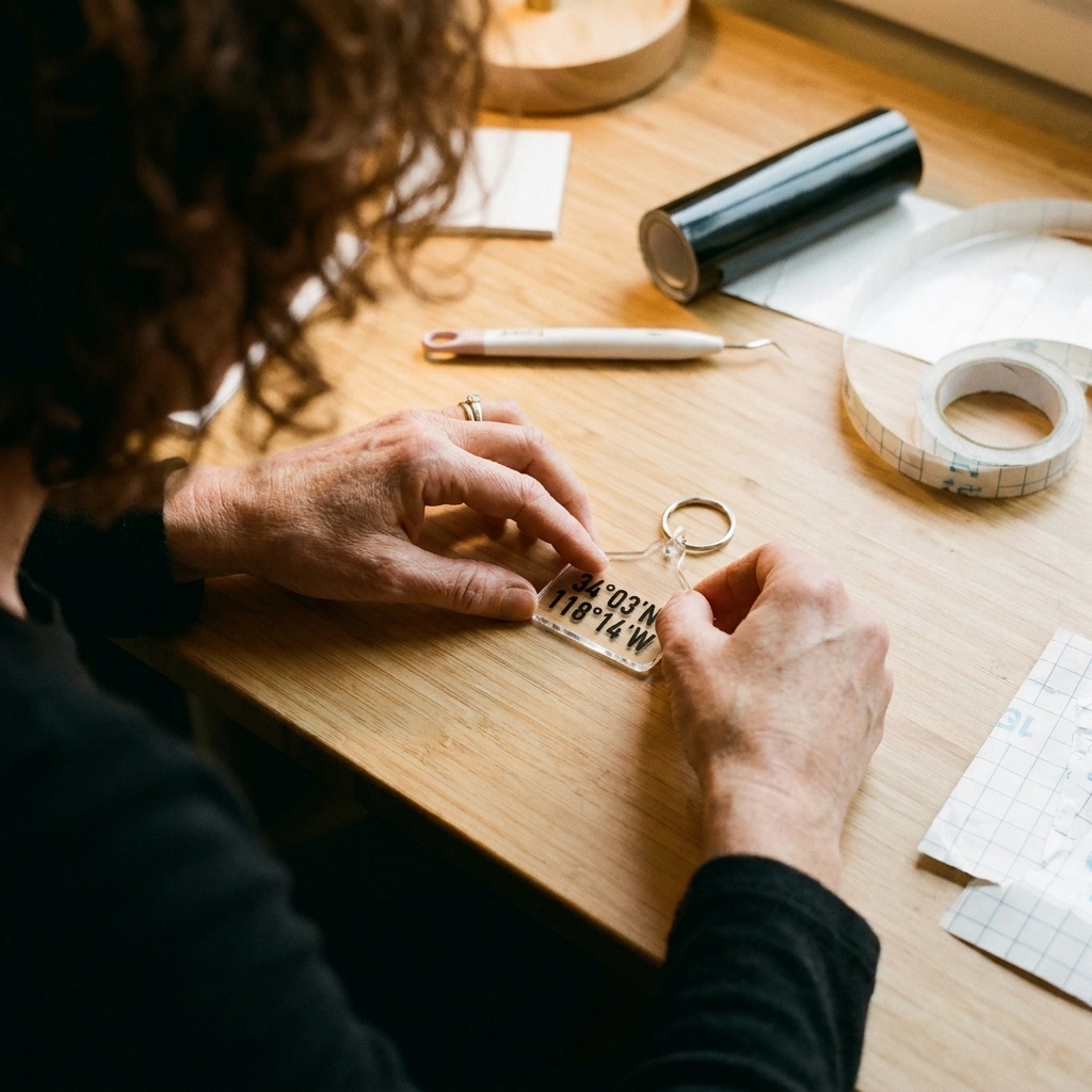
Once your vinyl is weeded, application is where the project starts to feel “store-bought” in the best way.
Prep the acrylic so the decal stays put
- Leave the protective film on the acrylic until you are ready.
- Peel, then wipe the surface with isopropyl alcohol and let it fully dry.
- Avoid touching the cleaned area with your fingertips.
Placement tips for centered text
- Lightly mark the center with a removable marker on the protective film side, or use a small piece of painter’s tape as a guide.
- For two lines (coordinates + date), keep the line spacing slightly generous so the design does not feel cramped.
- If your keychain has hardware holes, visually balance the text with that top weight.
Burnish, then peel slowly
Burnish with firm, even strokes. Then peel the transfer tape back on itself at a low angle. If any tiny element lifts, lay the tape back down and burnish again before trying another slow peel.
Seal or not seal?
On acrylic keychains, permanent vinyl often holds well without a sealer if the surface was cleaned and the decal was applied smoothly. Durability still varies by vinyl brand and how the keychain is treated, so I think of this as “usually” rather than “always.”
If the keychain will live a rough life (jangling with keys, tossed into bags, exposed to hand sanitizer), consider a clear protective layer appropriate for acrylic. Test first on a scrap blank because some finishes can haze plastics.
One more thing that helps: give the adhesive time to settle. If you can, leave the keychain alone and keep it dry for at least 24 hours. Full bond strength often improves over 48 to 72 hours.
Picking coordinates that are accurate
The emotional part is easy. The technical part is making sure the numbers point to the right place.
My quick accuracy routine
- Find the location in a map app and drop a pin exactly where you mean, not just the city.
- Copy the decimal coordinates.
- Paste them into a second place and confirm it lands on the same spot.
- Decide how many decimals you actually need.
Minus signs and direction
This is the mistake I watch for most often: if you are using decimal degrees, west and south coordinates are typically shown with a minus sign. If you drop that minus sign, you can end up in the wrong hemisphere. If you prefer not to rely on minus signs, use N/S/E/W notation instead and keep it consistent across both coordinates.
How many decimals should you use?
More decimals means more precision, but also smaller text. A helpful way to think about it is that each additional decimal place is about 10x more precise. Approximate scale (especially near the equator) looks like this:
- 4 decimals (0.0001°): about 11 m (about 36 ft)
- 5 decimals (0.00001°): about 1.1 m (about 3.6 ft)
- 6 decimals (0.000001°): about 0.11 m (about 4 in)
One caveat: longitude “tightens” as you move away from the equator, so east to west distance per decimal place depends on latitude. For keepsake keychains, I usually like 5 decimals because it still reads cleanly and feels specific without turning the text into a micro-punctuation obstacle course.
Date formats that stay readable
- 05.14.2018 (balanced and compact)
- 14 May 2018 (romantic, a bit longer)
- EST. 2018 (clean and classic)
If you are trying to decide between a date and a word, I love the clarity of intentional wording. Defining Intentionality for Journal and Bookbinding Projects applies beautifully to small keepsakes too.
Common tiny-weeding problems
“My letters are lifting when I pull the excess vinyl.”
- Pull slower and at a lower angle.
- Try reverse weeding (transfer tape first).
- Increase character size slightly or choose a sturdier font.
“The centers of my numbers won’t come out cleanly.”
- Use a sharper blade or a fresh mat.
- Check that you are not under-cutting. A too-light cut makes interiors tear.
- Use tweezers after lifting the edge with a hook.
“My dots and commas disappear.”
- Make punctuation slightly larger than default.
- Increase spacing around punctuation.
- Use an offset, or attach punctuation to a thin baseline line to keep it anchored.
“The transfer tape is too sticky and distorts my text.”
- Lightly de-tack the tape by pressing it against clean fabric first.
- Switch to a less aggressive transfer tape.
- Burnish the vinyl to the acrylic more than you burnish the tape to the vinyl, then peel slowly.
Coordinate ideas that feel personal
If you are making these as gifts (or even as a small batch product), the words around the coordinates can do a lot of emotional work without adding much weeding complexity.
- “the beginning” + coordinates
- “where we became us” + date
- “back to you” + hometown coordinates
- “rooted” + coordinates
- “meet me” + coordinates
If you want more vocabulary that carries that grounded, home-and-belonging feeling, 12 Words That Mean Home and Belonging is a lovely place to wander.
Quick checklist before you cut
- I can read every character at actual size without zooming.
- Minus signs, decimals, and commas have breathing room.
- My coordinate format is consistent (decimal degrees or DMS, not both).
- If I am using decimal degrees, I kept the minus sign for west and south (or used N/S/E/W).
- My font is not hairline-thin.
- My blade is sharp and my mat is clean.
- I tested a small sample cut.
- I checked the coordinates in two places.
Tiny letters can be fussy, yes. But when you get the hang of it, coordinate keychains become one of the most satisfying small makes: practical enough to carry daily, and meaningful enough to keep for years.