

Every time I help a maker tighten up the wording on a sign, I end up giving the same quiet reminder: the words are the message, but the readability is the delivery. On a mirror, that delivery has an extra challenge. You are asking letters to stay crisp on a slick surface, in humidity, while competing with reflections and changing light.
The good news is that layered vinyl is one of the simplest ways to add depth without turning your bathroom into a full paint project. If you do it thoughtfully, you can get a clean “drop shadow” look that makes daily affirmations easier to read at 7 a.m. and still charming at 7 p.m.
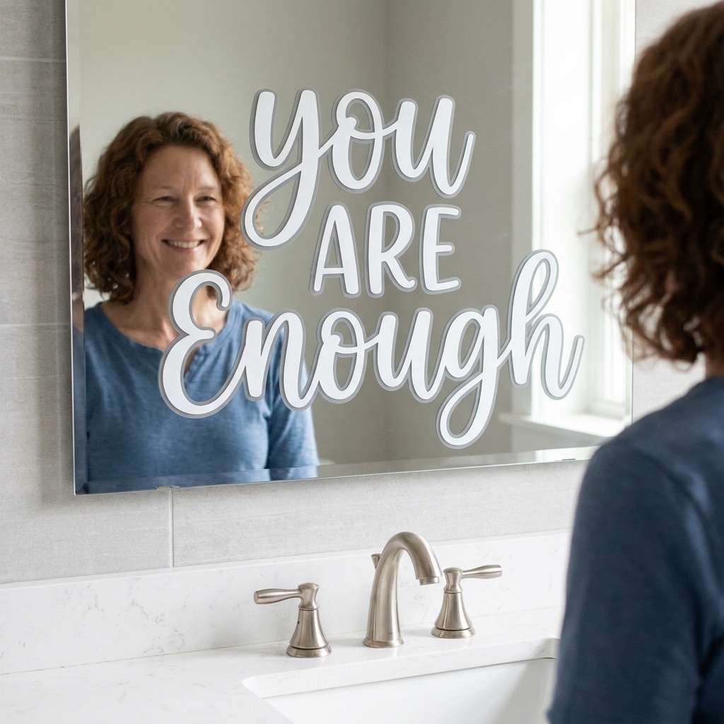
What layering means on glass
When we talk about layering vinyl letters, we usually mean one of two depth effects:
- True layer: a second vinyl cut placed directly underneath the top layer, matching the shape of each letter.
- Shadow layer: a second vinyl cut intentionally offset a little (down and right is classic), so it peeks out as a shadow.
On mirrors, I recommend the shadow layer for quotes and affirmations. It is forgiving, it reads clearly from a distance, and tiny imperfections look intentional rather than “misaligned.”
Materials that hold up
Humidity and cleaning products are the villains here, so start with materials that can take a little real life.
What to use
- Permanent adhesive vinyl for both layers. It is typically the most reliable choice for bathrooms.
- Transfer tape that matches your vinyl finish. Standard grip transfer tape usually works well, but very textured or glitter vinyl may need stronger tape.
- Isopropyl alcohol (70% or higher) and a lint-free cloth for prep.
- A felt edge squeegee or an old gift card wrapped in soft cloth to prevent scratches.
- Painter’s tape for hinge alignment.
What to avoid
- Removable vinyl if you want this to last. Some removable vinyls do fine on glass, but permanent is usually more dependable in steamy rooms.
- Application on anti-fog films or coated mirrors without testing. Some coatings reduce adhesion.
- Placing vinyl where you routinely spray cleaner, like the bottom edge of a mirror above the sink. You can, but expect more wear.
If you want a quick primer on setting yourself up for success with cut text, our Cricut lettering guide is a helpful companion.
Pick readable quotes
Mirrors are visually busy, even when they are “empty.” Before you cut anything, make sure the quote works in the environment.
A quick checklist
- Keep it short: 3 to 9 words is the sweet spot for most vanity mirrors.
- Use strong, plain words: short vowels and simple syllables read best in reflection.
- Avoid delicate scripts for long sentences. They can blur once a shadow is added.
- Give the quote room: more negative space makes the shadow effect look intentional, not crowded.
If you are still deciding what to put up, you may like these short inspirational quotes. Many translate beautifully to mirrors because they are compact and rhythmic.
Vinyl finish and size
Two small choices make a big difference on reflective glass: finish and scale.
Matte vs glossy
If your bathroom gets a lot of bright overhead light, matte vinyl often reads better because it reduces glare. Glossy can look sleek, but it is more likely to catch hotspots and reflections right across your letterforms.
How big to cut letters
As a rule, I err larger than I think I need. For a quote you want to read from a normal standing distance at the sink, aim for letters that are roughly 1 inch tall or more, especially if you are using script or adding a shadow. If your mirror is across the room (or you want it readable without glasses), go bigger.
Designing the shadow in Design Space
You can build the shadow in a few ways. The easiest, especially for beginners, is to duplicate the text and offset it manually.
Method A: Duplicate and nudge
- Create your text and finalize the font choice and size.
- Duplicate the text layer.
- Change the duplicate color to your shadow color (this helps you stay oriented).
- Nudge the shadow down and to the right using the arrow keys. Start tiny. Think “a hairline,” not “a full letter width.”
- Align: Select both layers, center them to each other, then nudge the shadow again until the peek looks even across the whole quote.
- Attach each color layer so spacing stays true when cutting.
Tip from too many late-night recuts: if your text is very thin, the shadow should be smaller than you think. A chunky shadow behind thin strokes can look fuzzy on reflective glass.
Method B: Offset tool
If you use Design Space’s Offset feature, you will get an outline style shadow rather than a crisp “duplicate behind.” It can look great for single words, but for a multi-word affirmation it can get visually heavy. If you go this route, keep the offset narrow.
Cutting and weeding tips
Layered quotes fail most often at the tiny stuff: centers of letters, dots, and narrow strokes that stretch during transfer.
- Mirror your mindset, not your design: You only need to mirror your cut if you are applying the vinyl to the back side of glass or acrylic.
- Use a fresh blade for small text. Clean cuts make cleaner layers.
- Weed slow and close to the surface: pull the excess vinyl back over itself at a low angle.
- Consider a tiny test cut if your quote includes thin script, apostrophes, or commas.
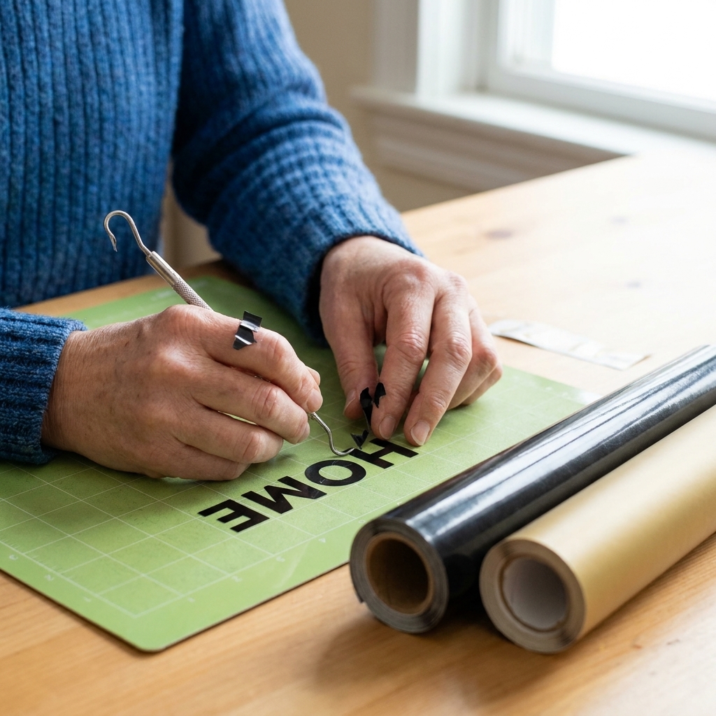
How to layer vinyl on a mirror
This is my favorite method because it keeps your spacing consistent and reduces the chance of bubbles between layers.
1) Prep the mirror
- Clean the mirror with your usual glass cleaner first, then dry fully.
- Wipe the application area with isopropyl alcohol to remove residue.
- Let it air dry for a minute. Do not touch the area with your fingers afterward.
2) Build the decal off the mirror
You can layer directly on the glass, but it is harder to align. Instead, assemble the two colors into one decal first.
- Keep both vinyl layers on their backing after weeding.
- Apply transfer tape to the top layer (the front color you want people to notice first).
- Lift the top layer with transfer tape off its backing.
- Hover and align the top layer over the shadow layer (still on its backing) until the offset looks perfect.
- Stick the top layer down onto the shadow layer, pressing firmly so they bond.
- Burnish across the whole design so both layers adhere well to each other.
At this point, you have a single layered decal held by transfer tape, ready to place.
3) Use the hinge method
- Hold the decal up to the mirror and step back. Mirrors can trick your sense of level up close.
- When placement looks right, tape a horizontal strip of painter’s tape across the top edge of the transfer tape to create a hinge.
- Flip the decal up on the hinge, peel away the vinyl backing, then flip it back down.
- Burnish from the center outward.
4) Remove transfer tape slowly
- Peel the transfer tape back slowly at a low angle (almost flat to the mirror).
- If a letter lifts, lay the tape back down, burnish again, then try a different angle.
5) Give the adhesive time
Permanent vinyl adhesive often strengthens over time. If you can, avoid spraying cleaner directly on the decal for 24 to 48 hours. Depending on the vinyl, room temperature, and humidity, a full bond can take longer, so gentler cleaning early on is your friend. After that, dab cleaner onto a cloth instead of spraying the mirror near the vinyl.
Color pairings that read well
On a mirror, contrast does more work than you think. You want the top layer to pop, and the shadow to quietly support it.
- Black + warm gray shadow: clean, minimal, and forgiving in any bathroom style.
- White + light gray shadow: airy, but only if the mirror is not backed by a white wall that washes it out.
- Deep green + black shadow: rich and calm, great with plants or wood tones.
- Navy + slate shadow: strong without feeling harsh.
- Terracotta + cocoa shadow: warm, cozy, and less stark than black.
If you are ever unsure, choose a shadow color that is two steps darker than the main color, not a full leap. Harsh contrast shadows can start to look like a misprint.
Spacing that looks polished
This is the editor part of my brain speaking: the difference between “handmade” and “custom” is often just spacing.
Three spacing rules
- Give ascenders and descenders breathing room: letters like g, y, p, and j need space below the line so the shadow does not muddy them.
- Increase line spacing slightly for stacked quotes. Shadows make lines feel closer together than they really are.
- Avoid ultra tight kerning on script fonts. A shadow will fill in those tight gaps and reduce legibility.
If you are laying out a longer phrase and want it to feel balanced, the approach in hand lettering long quotes on A5 journal covers carries over beautifully to mirror decals.
Troubleshooting
My shadow layer looks crooked
- Fix: In Design Space, zoom in and nudge using arrow keys, not your mouse.
- Fix: When assembling the layers, align one “anchor letter” first (like the first letter of the first word), then press outward.
Bubbles between layers
- Fix: Burnish the top layer onto the shadow layer while the shadow is still on its backing. The backing provides a firm surface.
- Fix: Use slow, even pressure from the center out.
Small letters lift when I remove transfer tape
- Fix: Switch to a less sticky transfer tape if yours is too aggressive for thin text.
- Fix: Burnish longer than you think, then peel the tape back flat to the surface.
Vinyl edges start peeling after a few weeks
- Fix: Revisit placement. If the decal sits where cleaner drips, steam hits, or hands touch daily, wear is inevitable.
- Fix: Clean with alcohol before applying and avoid applying right after a hot shower when the room is humid.
- Fix: Check that you used permanent vinyl, not removable.
Affirmations that suit a shadow
Here are a few that stay readable, even in a small mirror space:
- Start where you are.
- You are doing better than you think.
- Breathe in, let go.
- Small steps count.
- Today is yours.
- Gentle is still strong.
- Choose calm.
- Progress, not perfection.
If you want words with a little more weight behind them, you might like the vocabulary ideas in powerful words that mean strength. Single strong words can be stunning on a mirror with a soft shadow.
Care and removal
Vinyl on mirrors is generally low risk, but a few habits keep everything looking crisp:
- Do not scrape the decal with razor blades or abrasive scrubbers.
- Avoid ammonia-heavy cleaners directly on the vinyl if you want maximum longevity. It is less about the mirror and more about protecting the decal edges and adhesive. Spray onto a cloth and wipe around it instead.
- Keep decals away from edges where water pools or hands regularly grab the mirror frame.
If you ever need to remove it, warm the vinyl gently with a hair dryer and peel slowly. Any leftover adhesive can usually be cleaned with rubbing alcohol.