

I have a soft spot for long motivational quotes. They are the ones that feel like a tiny pep talk tucked into your bag. The only problem is that A5 journal covers are not endlessly patient. An elastic strap can eat your right margin. A stitched seam can swallow your first few letters. And an A5 notebook gives you a lovely, workable rectangle, but it will absolutely expose uneven spacing, crowded lines, and that one “extra” word you assumed would magically fit.
The good news is that hand-lettering a long quote is less about perfect handwriting and more about planning. Once you treat your cover like a layout puzzle, you can fit extended sayings in a way that looks intentional, calm, and readable.
Start with the real writable area
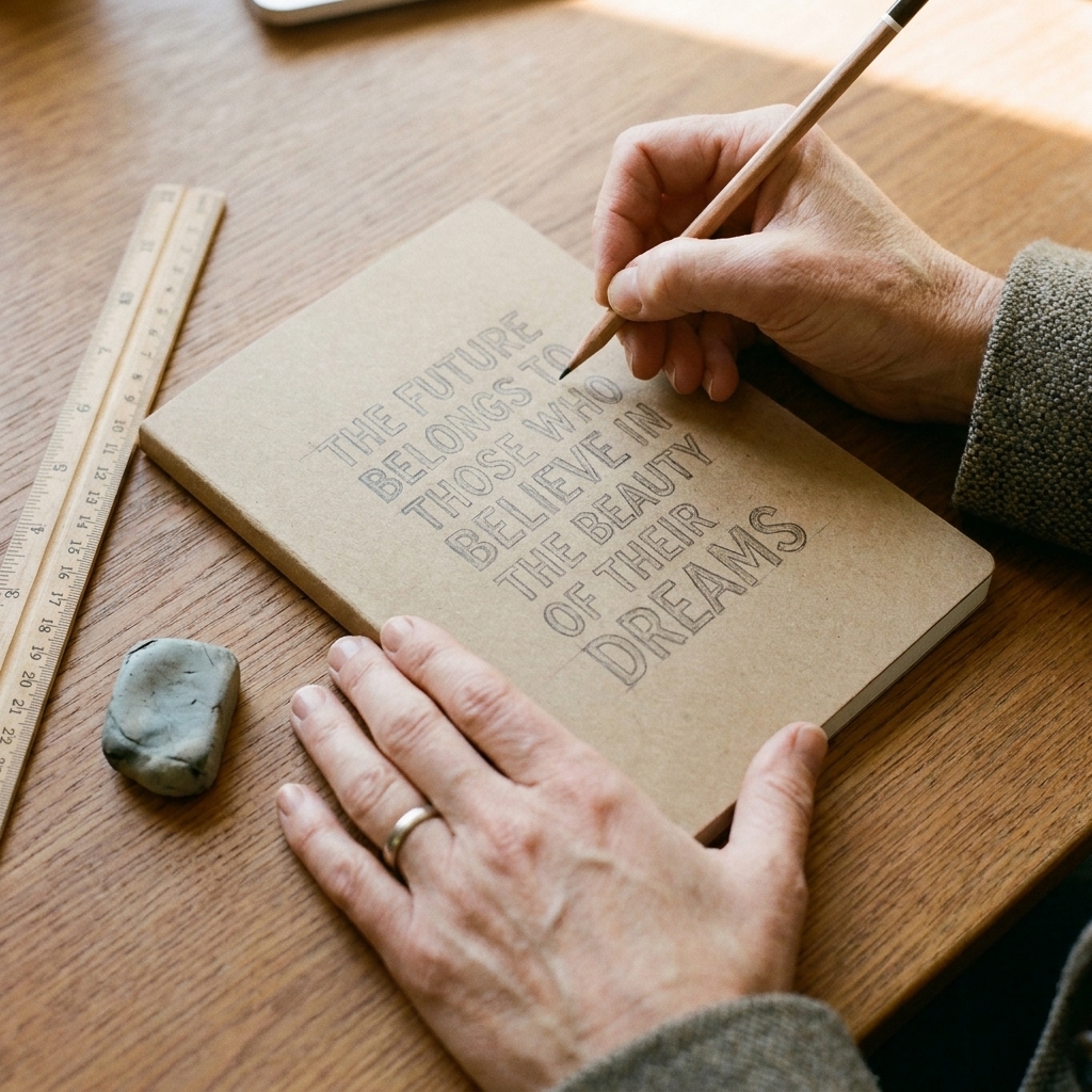
Before you pick a style, figure out how much space you truly have. Most A5 journals are about 148 x 210 mm (5.8 x 8.3 in), but the usable area is smaller once you account for rounded corners, elastic bands, thick seams, or a border you want to leave blank.
Margins that usually work
- Minimum margin: I like 8 to 10 mm on all sides (more if the cover has stitching or a frame).
- Comfort margin: 12 to 15 mm for a more airy, designed feel.
- Baseline guide: Lightly pencil a rectangle inside those margins. That is your “typesetting box.”
If you are working on a finished cover (leather, coated cloth, or a slick PU cover), do your full draft on paper cut to A5 first. Then transfer.
Choose the quote with layout in mind
Long quotes get awkward when every word is treated as equally important. Your job is to decide what the quote is about, then let the lettering show that.
A 30-second meaning edit
- Underline the 1 to 3 words that carry the emotional punch.
- Circle any optional words (often: “really,” “just,” “very,” “that,” “always”). If the quote is yours to adapt, trimming even one word can save a whole line.
- Mark natural pause points with slashes. These are your likely line breaks.
If you want help choosing a quote that is already short enough to behave on small surfaces, start with these short inspirational quotes. Even if you are not embroidering, the length constraints are the same.
Pick a simple hierarchy
When a quote is long, hierarchy is what keeps it from looking like a paragraph. I like to plan for two, sometimes three, visual “voices.”
A reliable three-voice combo
- Voice 1 (headline): big, confident letters for the key words.
- Voice 2 (support): a simpler print or a smaller script for the rest.
- Voice 3 (whisper): tiny caps or small print for connector words like “and,” “to,” “the,” “of.”
Limiting yourself to two main styles is often the difference between “designed” and “busy.” If you are newer to letterforms, my Cricut-focused guide still helps with spacing and consistency, even if you are drawing by hand: Cricut lettering tips and spacing basics.
Do thumbnails first
This is the step most people skip, and it is the step that saves you from starting over.
Thumbnail method
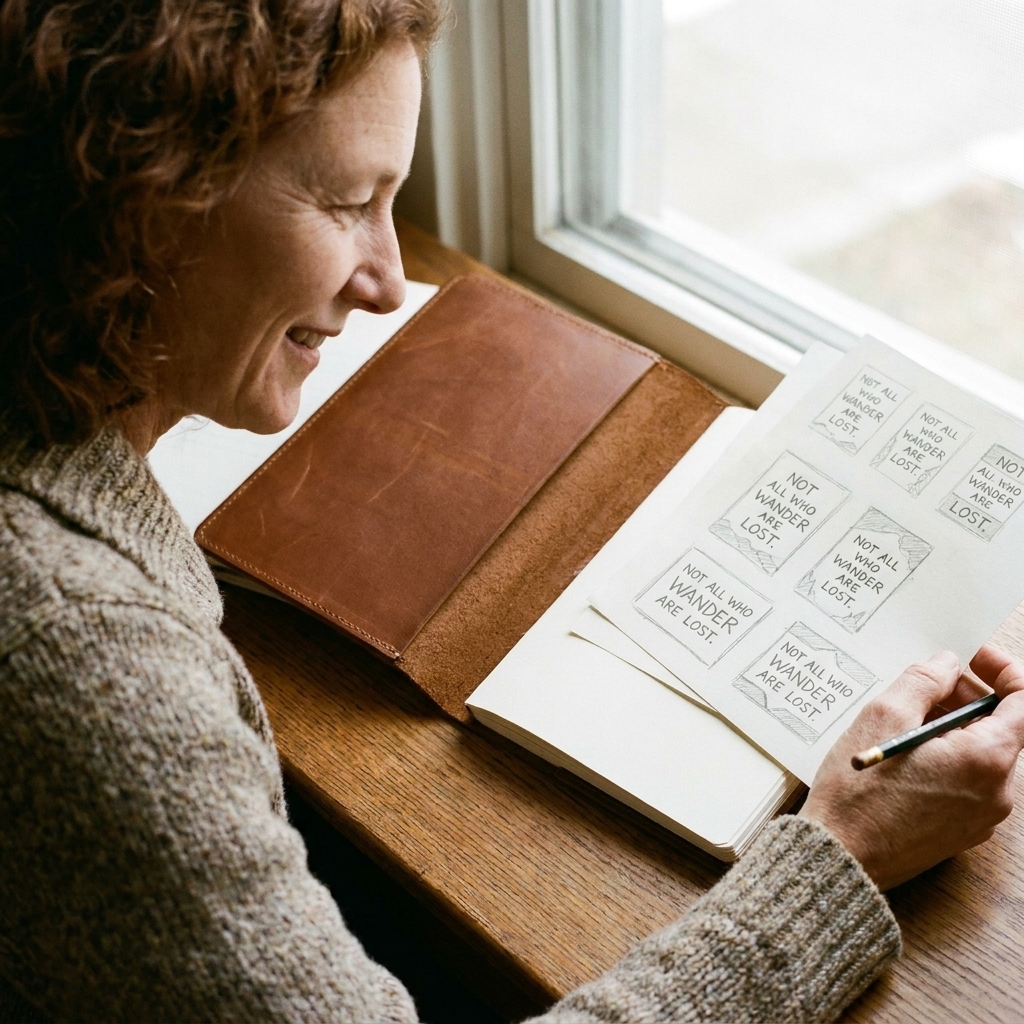
- Draw 6 to 9 tiny rectangles on scrap paper, each roughly the proportions of an A5 cover.
- Write the quote as blocks, not letters. Use lines and rectangles to stand in for words. You are planning weight and spacing, not calligraphy.
- Try different line-break options: centered, left-rag, stepped, or stacked “poster” style.
- Pick the one you can read instantly from arm’s length. The best layout is the one your eye understands quickly.
Use a pencil grid
Here is the practical trick: instead of guessing line spacing, give yourself a faint grid so your lines behave.
A simple A5 grid
- Inside your margin box, draw light horizontal guidelines about 10 to 14 mm apart. (I go looser if I know I want flourishes.)
- Add one vertical centerline if you plan to center the quote.
- If your cover is dark, use a white pencil or chalk pencil for guidelines on your paper draft, then transfer only the final lettering.
Think like a book designer: baselines first, style second.
Break lines by shape
People often try to make each line the same number of words. That is not what looks balanced. What looks balanced is when the overall text block forms a pleasing shape.
Line-break rules I rely on
- Avoid lonely runts: try not to leave a single short word on its own line (especially “to,” “and,” “the”). Attach it to a neighbor.
- Keep phrases together: do not split “keep going” or “begin again” unless you have a strong reason.
- Stair-step on purpose: if you want varied line lengths, make the variation look intentional, not accidental. For example: long line, medium line, short line, medium line.
- Let a key line be wide: your main phrase can stretch nearly the full width of the margin box, then the supporting lines can tuck in.
Choose readable styles
A long quote forces some words to be small. The enemy is a delicate script that turns to fuzz at tiny scale.
Good choices for small words
- Simple sans serif print (upright, clean, evenly spaced).
- Small caps style (uppercase shapes drawn at a smaller, consistent height). If you do not have true small-cap letters available, you can fake the feel by using neat, slightly smaller all-caps for the less important words and full-size caps for emphasis.
- Monoline script (no heavy thick-thin contrast) if you want softness without losing clarity.
Save these for headline words
- Very loopy script with tight loops.
- Extra-condensed capitals (they can look pinched).
- Heavy brush lettering everywhere (it becomes a dark brick).
If your quote is emotionally warm rather than “hustle,” you might also enjoy the nuance in word choice between similar feelings. I wrote about that difference here: joy vs happiness. It is surprisingly useful when you are picking the exact quote for a cover.
Pick pen and ink that behave
This is the real-world step that saves your layout from smudges, skipping, and heartbreak. Before you commit, test your tools on the back cover, the inside cover, or a scrap of similar material.
Quick tool matches by cover type
- Paperboard or cardstock covers: fineliners, brush pens, gel pens can all work. Watch for bleed-through if the cover is thin.
- Coated, glossy, or PU covers: paint markers or acrylic markers tend to grip better than watery ink. Let layers dry fully before you rest your hand on them.
- Cloth covers: markers can feather along the weave. A slightly thicker tip often looks cleaner than an ultra-fine one.
- Leather covers: test first for absorption and spreading. Some inks sink in fast and go darker than you expect.
Two small habits help almost every surface: (1) do a quick dry-time test, and (2) keep a clean scrap of paper under your hand as you work.
Spacing that looks calm
Lettering looks polished when the spacing is even, not necessarily when the letters are perfect. I think of it as making sure every character has the same amount of elbow room.
Three spacing tricks I use
- Count in gaps, not letters: step back and look at the negative space between strokes. Adjust until it feels consistent.
- Watch tricky pairs: combinations like A V, T o, W a often need nudging because their shapes create accidental holes.
- Build in breathing room around flourishes: a swash or underline counts as visual weight. Give it space so it looks elegant, not cramped.
For extended quotes, I prefer slightly wider tracking (letter spacing) on small caps and printed text. It keeps the quote readable even if your cover is viewed quickly.
Use simple fillers
Sometimes you end up with a stubborn empty corner. The solution is not always “add a flower.” The best fillers help the reader move through the quote.
Fillers that support the words
- Thin divider lines above or below the headline phrase.
- Small dots or diamonds between clauses.
- Tiny leaf sprigs only if they match your journal’s vibe and do not compete with the quote.
- Subtle banner shapes behind one key word (drawn lightly so it reads as emphasis, not a sticker).
Transfer your layout cleanly
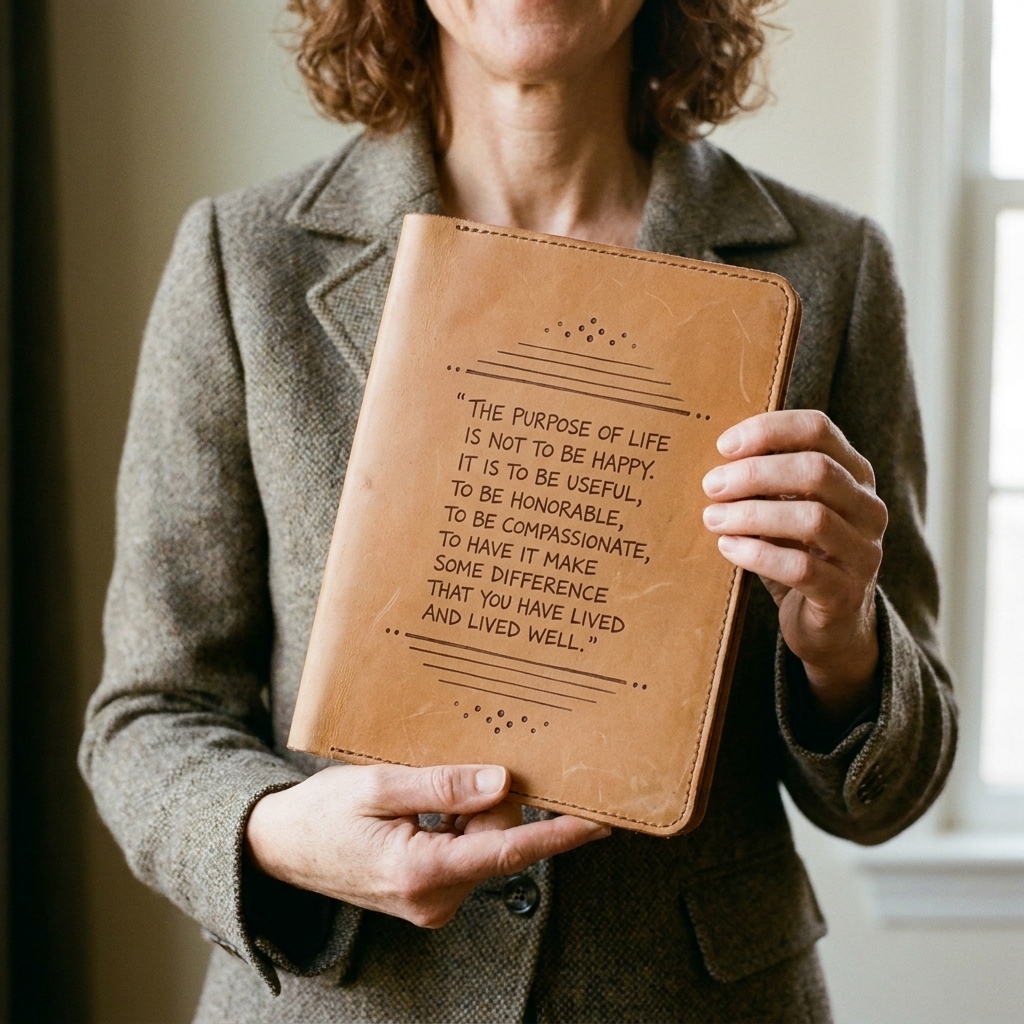
If you are lettering directly on the cover, aim for a transfer method that does not dent or smudge the surface.
Low-stress transfer options
- Pencil rub transfer: shade the back of your paper draft with graphite, tape it to the cover, and trace the letters. Works well on paperboard or matte covers.
- Lightbox or window method: if the cover material is thin enough, tape it over your draft and trace. (Many covers are too opaque, but some kraft or cardstock covers work.)
- Grid transfer: draw a light grid on your draft and a matching grid on your cover, then copy square by square. Slow, but extremely reliable.
When in doubt, practice on a separate A5 sheet and only commit when you like the composition from arm’s length.
Finishing touches
The final 10 percent is where your cover starts to look like a designed object rather than writing on a notebook.
Small upgrades with big payoff
- Thicken only the downstrokes on headline script words for contrast.
- Unify stroke endings: decide whether your lines end blunt, tapered, or rounded and keep it consistent.
- Choose one accent color (if any) and use it sparingly, like highlighting one keyword or adding tiny separators.
- Erase guidelines last, and erase outward from the lettering so you do not smear your ink.
If you want a deeper approach to choosing words that feel true to the maker behind the gift, I also love this piece on intentional messaging: defining intentionality for journal and bookbinding projects.
A worked example
Here is one long quote I love for journals because it reads like a steady hand on your shoulder:
“Do not judge each day by the harvest you reap but by the seeds that you plant.”
One clean A5 layout (with hierarchy) could look like this:
- Small caps (whisper):
DO NOT JUDGE EACH DAY - Big headline (voice 1):
BY THE HARVEST - Small print (voice 2):
YOU REAP - Divider line
- Small print (voice 2):
BUT BY THE SEEDS - Big headline (voice 1):
YOU PLANT
Notice what is happening: the connectors stay quiet, the two emotional anchors get the biggest weight, and the whole block makes a tidy rectangle without any lonely one-word lines.
A layout recipe
Here is a structure that works beautifully on A5 because it creates rhythm without feeling crowded.
- Line 1 (small caps): short opener (2 to 4 words)
- Line 2 (headline script or bold caps): main phrase (1 to 3 punch words plus one support word)
- Line 3 (small print): supporting clause
- Divider line
- Lines 4 to 6 (simple print): rest of quote, broken into phrase-sized chunks
- Final line (small caps): closing emphasis or repetition
This headline-plus-body-copy approach borrows from editorial design, which is exactly what long quotes need.
Common problems
It looks like a dense paragraph
- Increase line spacing slightly.
- Introduce hierarchy: make one phrase larger and one set of connector words smaller.
- Add a thin divider line to create a visual pause.
I ran out of space at the bottom
- Reduce the size of the least important lines first.
- Switch small script to small caps print. It often takes up less vertical space.
- Rewrite line breaks so you have fewer total lines, even if some lines become longer.
Centered layouts look wobbly
- Use a vertical centerline and measure the start and end of each line against it.
- Keep your longest line near the center of the composition, not at the top or bottom.
My script is readable, but it feels messy
- Limit flourishes to one per headline word, maximum.
- Make your x-height consistent (the height of lowercase letters like a, e, o).
- Switch your supporting text to a clean print so the script can shine.
A gentle closing thought
Long quotes are worth the effort because they turn an ordinary notebook into something that feels like a companion. If you plan the hierarchy, build a baseline grid, and break lines by shape rather than by word count, you can fit surprisingly expansive language onto an A5 journal cover without it feeling cramped.
And if you catch yourself rewriting a quote to make it fit, I consider that a win. You are not cheating. You are editing, which is one of the most maker-friendly forms of care.
If you want more quote ideas and guidance on choosing sayings for different projects, you can browse the hub here: Quotes and Sayings guide.