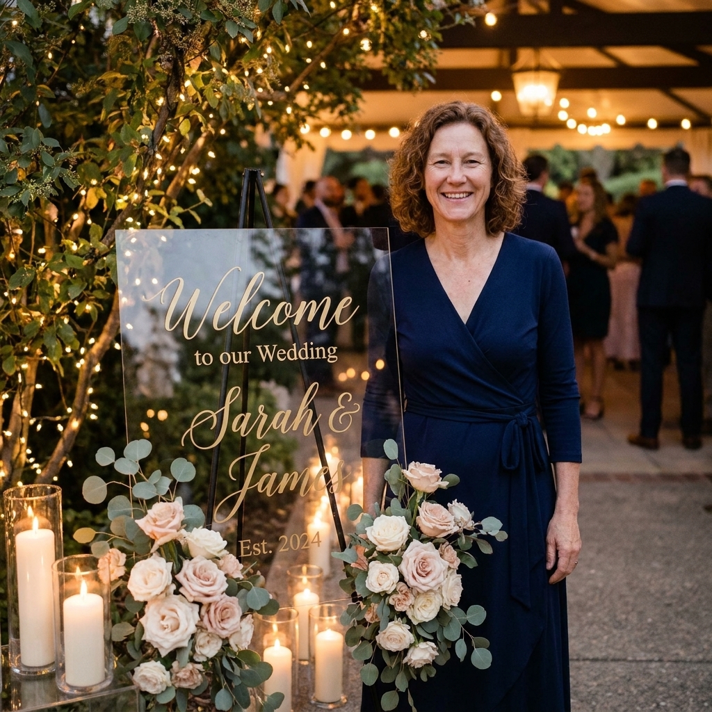

The best acrylic wedding welcome signs do two jobs at once: they guide guests, and they set the emotional tone before anyone even finds their seat. I learned this the hard way years ago while helping at a local arts festival. We had gorgeous signage, but the wording was fussy and the hierarchy was unclear, so people kept stopping to ask what was where. Weddings are more emotionally intimate spaces, but the lesson holds: clarity is part of hospitality.
This guide walks you through choosing inviting language, deciding what information actually belongs on the sign, and formatting your layout so it feels light and intentional on clear acrylic.
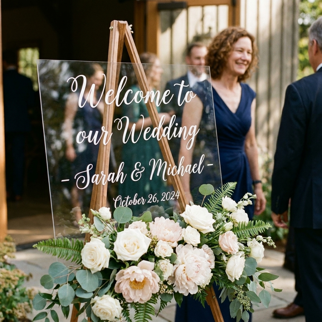
Start with the job of the sign
Before you pick fonts or decide whether to include a quote, answer one question:
What do guests need to know in the first 10 seconds?
- Welcome and confirmation: they are in the right place.
- Names: whose wedding it is (and how the couple wants to be named).
- Date: helpful for keepsake value and photos.
- Optional direction: “Please take a program,” “Ceremony this way,” or “Unplugged ceremony” if you need it.
If you need heavy logistics, think schedule details, shuttle instructions, or a full seating list, acrylic can do it, but it often looks cleaner when those items live on separate signs. Think of your welcome sign as the opening sentence, not the whole paragraph.
Choose wording that fits
Acrylic reads modern and light by nature. The wording can either match that simplicity or intentionally warm it up.
Three tones that work on acrylic
- Classic and formal: “Welcome to the wedding of” or “Together with their families…”
- Warm and conversational: “Welcome, we’re so glad you’re here”
- Minimalist: just names and a date, with “Welcome” as a small header
Reliable welcome lines
- Welcome to our wedding
- Welcome, we’re so happy you’re here
- Welcome to the celebration of
- Welcome to the wedding of
- Glad you’re here
- With joy, we welcome you
If you want to add a quote
Quotes can be lovely, but on acrylic they can also turn into a block of visual noise quickly. If you include one, keep it short and treat it like a subtitle. My personal rule of thumb is 10 words or fewer. For longer vow-style lines, I like splitting the words across multiple surfaces instead of forcing them onto one sign. This approach is similar to the layout logic in Splitting Quotes Across Three Canvases.
A note on “the Smiths” wording
A common traditional format is “Welcome to the wedding of Emma & James” rather than “Welcome to the Smiths.” But there is no single right choice. If you do want “The Smiths,” consider whether it fits your values and your names. Many couples keep their own last names, hyphenate, or create something new. Your sign is a small but meaningful place to reflect that intentionally. If you like thinking through language choices this way, you might also enjoy Defining Intentionality for Journal and Bookbinding Projects.
What to include (and leave off)
Here is my practical checklist. If you include everything, acrylic can look crowded. If you include too little, it can feel unfinished. This balance is the sweet spot.
The almost-always set
- Welcome line (or a simple “Welcome”)
- Names
- Date (at least month and year)
The include-if-helpful set
- Venue name (especially if it is a shared property with multiple buildings)
- Ceremony start time (only if guests truly need it there)
- Directional cue: “Ceremony” with an arrow, or “Please sign our guest book”
- A short quote (kept to a subtitle length)
The usually-better-elsewhere set
- Full schedule
- Hashtag
- Registry info
- Lengthy “house rules” paragraphs
If you are designing multiple signs for the day, it helps to keep your phrasing consistent across all of them. If you want a broader overview of what kinds of signs tend to work best, start with Guide: Sign Ideas.
Name formatting details
Names are the center of the sign, which means tiny choices become surprisingly visible.
Pick one name style and commit
- First names only: “Emma & James” (clean and modern)
- First + last names: “Emma Carter & James Smith” (more formal)
- Written-out and: “Emma Carter and James Smith” (a softer, more traditional read)
- Shared surname line: “The Smiths” or “The Smith Wedding” (a vibe, but not for everyone)
And vs ampersand
An ampersand (&) is compact and visually balanced. “And” reads softer and more literary. If your fonts are already expressive, the ampersand often keeps things from feeling too curly or crowded.
Middle names and nicknames
If you love the idea of including a nickname or middle name, use it only if it is how people genuinely know you. Otherwise, it can look like a legal document in the middle of a romantic entrance moment.
Order of names
There is no single correct rule. Most couples choose what looks best typographically, what flows best when spoken, or a meaningful personal reason. My only hard advice is consistency: if you have multiple signs, keep the same order everywhere.
Layouts that stay readable
Acrylic is visually light, which means spacing and hierarchy matter more than they do on solid backgrounds. Here are layouts that stay readable in real venues with real lighting.
A classic hierarchy
- Line 1 (small): Welcome to our wedding
- Line 2 (largest): Names
- Line 3 (small): Date
A modern minimalist hierarchy
- Line 1 (medium): Names
- Line 2 (small): Date
- Line 3 (smallest): Welcome
A romantic subtitle hierarchy
- Line 1 (small): Welcome
- Line 2 (largest): Names
- Line 3 (small): A short quote
- Line 4 (small): Date
My spacing rule
If you are unsure, add more breathing room. Acrylic signs are often viewed from a few feet away, and they photograph best when the design has generous margins.
Fonts: readable first
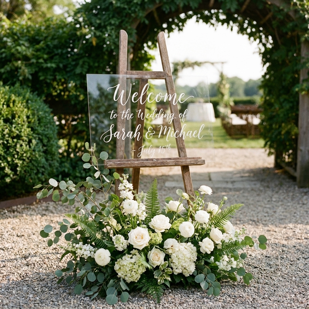
I love a dramatic script as much as anyone. But acrylic exposes readability issues quickly, especially outdoors, in glare, or against a busy background.
Acrylic-friendly pairing
- Script for names (one script only)
- Serif or clean sans-serif for everything else (welcome line, date, directions)
If you want a deeper walkthrough of pairing styles so they do not compete, see Pairing Script and Serif Fonts for Wedding Vow Keepsakes. The principles transfer beautifully to welcome signs.
Script rules that prevent the pretty-but-unreadable problem
- Use scripts with distinct letterforms (especially for capital letters).
- Avoid extremely thin strokes if your venue has backlighting or strong sun.
- Increase letter spacing slightly if your script looks crowded.
When all-caps works
All-caps looks clean for the welcome line and date, especially in a small sans-serif. Avoid all-caps for names in a script. It tends to look forced.
Acrylic specifics: glare and backside vinyl
Acrylic is gorgeous, but it behaves like acrylic in the real world. It reflects, it catches light, and it can make delicate lettering disappear if you are not planning for it.
Glare and reflections
- Do a light check: stand where guests will enter and look at the sign angle. If you see a bright window or the sun reflected in the panel, rotate the easel a few degrees or move it a step to the side.
- Choose calmer finishes: matte vinyl and paint pens tend to photograph with less glare than glossy finishes.
- Keep thin strokes practical: if you are hand-lettering with a paint pen, pick a tip size that will still read when the sign is backlit.
If you apply vinyl to the back
A lot of makers place vinyl on the back of acrylic to keep the front surface smooth and easier to wipe clean. If you do that, remember to mirror your design before cutting so it reads correctly from the front. For more on working with layered materials and keeping alignment clean, Layering Vinyl Letters on Mirrors uses the same kind of planning.
Design for distance
Most welcome signs are read from across an entryway, not up close. A gorgeous layout on your laptop can disappear at the venue if the scale is too delicate.
Practical sizing guidance
- Names should be the largest element by a clear margin.
- Welcome line should be readable at a glance without stepping closer.
- Date can be smaller but still crisp in photos.
Contrast choices that hold up in photos
- White vinyl: dreamy indoors, but it can vanish against bright windows or pale florals.
- Black vinyl: often the most readable and the most versatile in photos.
- Metallics: beautiful but they can glare or fade depending on lighting and angle.
If you are making your sign with vinyl, tiny thin letters can be frustrating to weed. I wrote more on managing delicate details in Weeding Tiny Letters for Coordinate Keychains. The weeding principles are the same, even if your project is larger.
Write, format, proof
Step 1: Draft three versions
Write a formal version, a warm version, and a minimalist version. Seeing options side by side makes it easier to tell what sounds like you.
Step 2: Choose your hierarchy
Circle the one thing that must be seen first. That is usually the names. Make that line the largest and give it the most breathing room.
Step 3: Set alignment
- Centered: classic, forgiving, and the easiest to balance.
- Left-aligned: modern and editorial, but it requires more careful spacing.
Step 4: Proof like an editor
When you are emotionally attached to the design, your brain fills in missing punctuation. Do a slow proof for:
- Spelling of names (especially if there are accents)
- Date formatting consistency (May 18, 2027 vs 18 May 2027)
- Ampersand consistency (& vs and)
- Capitalization style (Title Case vs sentence case)
Step 5: Do a distance test
Before committing to vinyl or paint, view your design from the spot where guests will first see it. If the welcome line disappears, bump the size up or choose a stronger font weight.
Wording sets to copy
Use these as starting points, then adjust to match your tone.
Classic
- Welcome to the wedding of
Emma Carter & James Smith
May 18, 2027 - Welcome
Emma & James
May 18, 2027
Warm
- Welcome, we’re so happy you’re here
Emma & James
May 18, 2027 - With joy, we welcome you
Emma Carter & James Smith
May 18, 2027
Minimal
- Emma & James
May 18, 2027 - Emma Carter & James Smith
05.18.2027
With a gentle direction
- Welcome to our wedding
Emma & James
Ceremony this way - Welcome
Emma & James
Please sign our guest book
Common mistakes
Too much text
Fix: Move logistics to a separate sign. Keep the welcome sign to three or four lines.
Everything is the same size
Fix: Make names clearly largest, then step the other lines down.
Script everywhere
Fix: Limit script to one line, typically names. Use a simple companion font for the rest.
Weak contrast in photos
Fix: If your venue has lots of light behind the sign, choose a darker vinyl or place the sign against greenery or a textured wall.
Crowded margins
Fix: Shrink the design slightly and increase outer padding. Acrylic looks best when it has room to breathe.
Final checklist
- Wording fits your tone and relationship, not just a trend
- Names are spelled correctly and formatted consistently
- Hierarchy is obvious from across the entry
- No more than two fonts (three only if you are very confident)
- Generous margins and line spacing for a clean acrylic look
- Contrast works in your venue lighting
- If vinyl is on the back, the design is mirrored before cutting
If you want a broader baseline for writing short, high-clarity sign text, Write Clear Words for a Small Sign pairs nicely with this wedding-specific guide.