

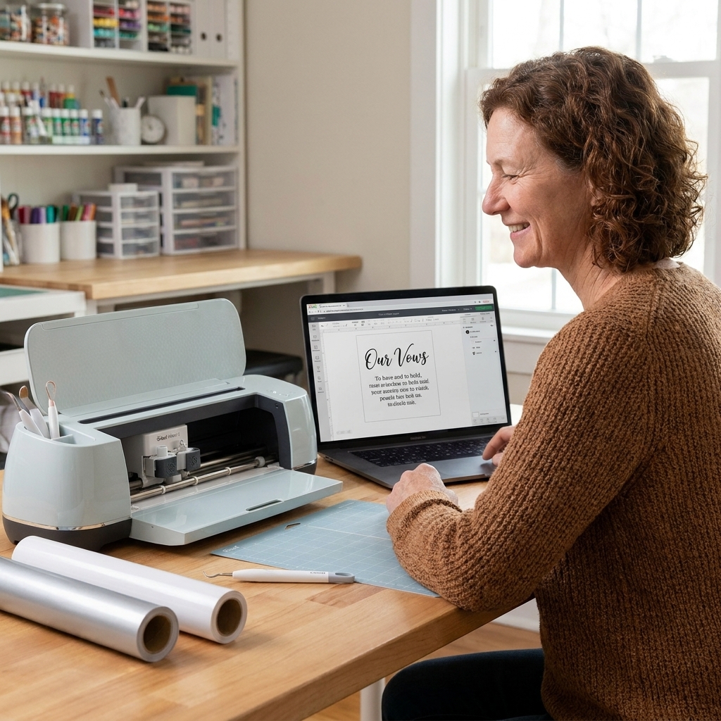
I have a soft spot for wedding vows as a keepsake. They are already beautifully written, but they are also long, personal, and tricky to format. In Cricut Design Space, the difference between “this looks like a wedding heirloom” and “this looks like a flyer” is usually just two things: font pairing and spacing.
Below are my go-to ways to pair a romantic script with a steady serif inside Design Space so your vows read clearly, cut cleanly, and still feel like they belong in a frame.
What makes a pairing work
Think of your two fonts as two jobs.
- Script font sets the mood. Use it for the title line, names, or a short vow excerpt.
- Serif font does the heavy lifting. Use it for the full vow text, dates, and small details.
The best pairings have contrast without conflict:
- High personality script + quiet serif (classic wedding look)
- Simple script + high-contrast serif (modern editorial look)
- Vintage script + old-style serif (antique letterpress feel)
One more rule that saves a lot of frustration: if your body text is more than a few lines, choose a serif with generous x-height (taller lowercase letters) so it stays readable when you size it down.
Favorite combinations in Design Space
Font availability varies depending on your Cricut access and the fonts installed on your computer. So instead of promising you will see a specific font every time, I am going to give you pairing recipes that are easy to reproduce with whatever Design Space offers you.
1) Flowing script title + bookish serif body
Use this for: framed vows, paper or vinyl overlays, and anything meant to be read up close.
- Script: a connected calligraphy style with clear letterforms (avoid super tangled swashes)
- Serif: a readable “book” serif with moderate contrast (not hairline-thin)
Layout tip: Keep your script to 1 line if possible. Two lines is fine, but only if you tighten line spacing and keep the second line shorter.
2) Minimal script accent + high-contrast serif body
Use this for: modern wedding style, black and white keepsakes, and vow prints that feel editorial.
- Script: simple, slightly slanted, fewer loops
- Serif: a Didone or modern serif look (high thin-thick contrast), but size it larger than you think
Cut warning: If your serif has very thin strokes, choose cardstock or a pen or foil option instead of tiny vinyl text.
3) Vintage script + old-style serif
Use this for: heirloom-style frames, sepia-toned designs, kraft paper, and engraved looks.
- Script: vintage sign-painter or formal script, not overly bouncy
- Serif: old-style serif with warm curves and slightly bracketed serifs
Layout tip: Add a little breathing room. Vintage styles look best when you do not pack every line to the edges.
4) All-caps serif names + script flourish
Use this for: vow “title cards” where the names take center stage.
- Serif: all caps for names (tracking increased)
- Script: only for a short word like “vows,” “forever,” or the date line
Design rule: When you set names in all-caps serif, keep your script smaller, like a signature under a headline.
Where to find fonts
If you are new to Design Space, this part makes everything else easier.
- Cricut fonts are the fonts you see inside Design Space under the Cricut font list (some are included, some require access).
- System fonts are the fonts installed on your computer. Once they are installed, they show up in Design Space under System.
When I say “use whatever Design Space offers,” I mean you can build the same look with many fonts, as long as you match the job: expressive script on top, steady serif for the body.
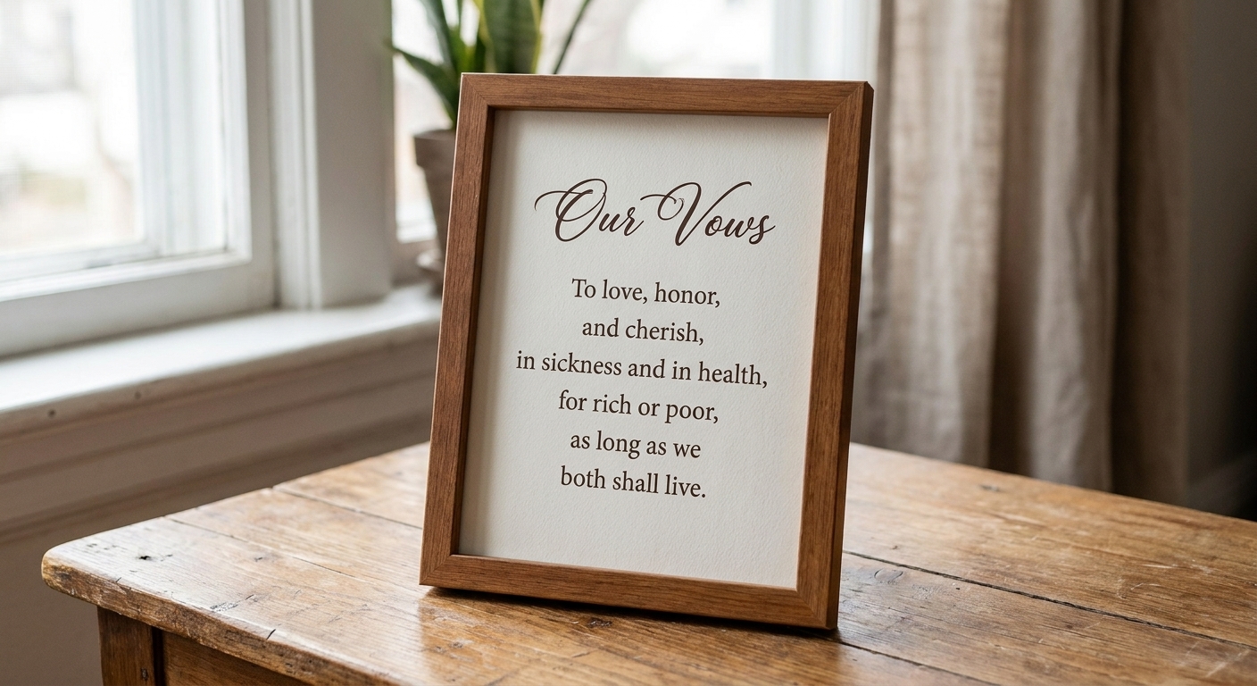
A clean hierarchy
If you want a reliable structure for long vows, here is a hierarchy I have used for makers who want a polished result without overthinking it:
- Line 1 (Script): “Our Vows” or “Wedding Vows”
- Line 2 (Serif, small caps or all caps): Names
- Line 3 (Serif, smaller): Wedding date and location (optional)
- Body (Serif): Full vow text
- Final line (Script or Serif): a short closing like “Always” or a shared phrase
It is a simple ladder: expressive at the top, readable in the middle, sentimental at the end.
Settings that keep vows readable
Pick the right project type
This is the fork in the road for vow projects.
- Print Then Cut is best if you want small text, lots of lines, and a truly book-like layout. Your printer handles the detail. Just keep in mind there is a printable size limit, so full-length vows may need smaller margins, multiple pages, or a different approach.
- Basic Cut is best if you are cutting vinyl for glass, acrylic, or a clean layered paper look. You will need larger text and fewer lines.
If you are trying to cut 150 to 300 words of vows as vinyl, you can do it, but you have to scale up and simplify. Otherwise the weeding will be punishing.
Use Letter Space and Line Space
- Script: reduce Letter Space slightly if the font looks “broken,” but do not crush it so much that loops collide.
- Serif body: increase Line Space until each line has daylight between it. Tight leading is what makes vow blocks feel cramped.
Cut-friendly size minimums
These are practical, not precious. Different materials, blades, and fonts vary, so treat these as a starting point and do a small test cut on your setup.
- Vinyl serif body text: letters around 0.25 in tall are often a comfortable place to start for weeding
- Intricate scripts: go bigger than you think, especially for thin entry strokes
- Paper or cardstock cuts: delicate serifs may tear if they are too thin or too close together
Make two fonts match
Match the energy
You can mix a modern serif with a traditional script if they share the same calm mood. What usually looks off is pairing a playful bouncy script with a very serious, formal serif body.
Repeat one detail
Pick one small visual echo:
- similar stroke weight (not identical, just not wildly different)
- similar slant (script leans right, serif italic for emphasis lines)
- similar terminals (rounded ends vs sharp ends)
- similar width (both more condensed, or both more open)
Let the serif do the talking
For long text, your serif should take up most of the “visual ink.” If the script is too prominent, the entire layout can start to look busy, like everything is trying to be the headline.
Common problems and fixes
My script looks choppy
In Design Space, try reducing Letter Space. If it still looks broken, that font is not drawn as a true connected script. In that case, choose a different script or use the script only for a short word where the breaks are less noticeable.
My vows look like a brick of text
Increase Line Space, and then shorten your line length by widening the margins. A slightly narrower text block reads more elegantly than edge-to-edge lines.
Thin serif parts disappear when I cut
Either increase size, switch to a lower-contrast serif (thicker hairlines), or move the body to Print Then Cut. Cutting ultra-thin serifs is where a lot of vow projects go sideways.
It looks like two random fonts
Try this fast reset:
- Make the script only the title line
- Set everything else in one serif
- Use bold or small caps for names instead of adding a third font
Two fonts is already a full conversation.
Workflows for long text
For Print Then Cut
- Paste your vows into one text box, then adjust Line Space first (it changes everything).
- When it looks right, consider flattening the text onto a background shape so it stays a single printable layer and does not drift as you keep editing.
- If your vows do not fit the printable area, split them into two coordinated prints (his and hers, or page one and page two) so you keep generous margins.
For Basic Cut
- Use the script for names or a short excerpt, then print the full vows separately for the frame backing.
- If you do cut body text, treat it like signage: bigger type, fewer lines, more spacing.
If you want more guidance on making text look intentional on small projects, my piece on writing clear words for a small sign has the same clarity-first principles, just applied to different kinds of keepsakes.
Checklist before you cut
- Script is used as an accent, not the whole paragraph
- Serif body is readable at your final size
- Line spacing gives each line room to breathe
- Margins keep the block from feeling squeezed
- You have chosen Print Then Cut vs Basic Cut on purpose
- You test a small section first, especially with delicate fonts
Wedding vows deserve a layout that feels calm and certain. When the serif is steady and the script is just a little romantic flourish, the whole piece reads like something meant to be kept.
For more Cricut-specific wording and layout help, you can also browse the Cricut Lettering guide, where I collect the practical stuff that makes projects look finished.