

I grew up writing letters the long way: pen, paper, second thoughts, cross-outs, then one more clean copy. Cricut pens feel like a modern cousin to that ritual. You still choose the words carefully, but you get help with the clean, even handwriting part. If you have ever made a gorgeous card front and then froze when it was time to write inside, this is for you.
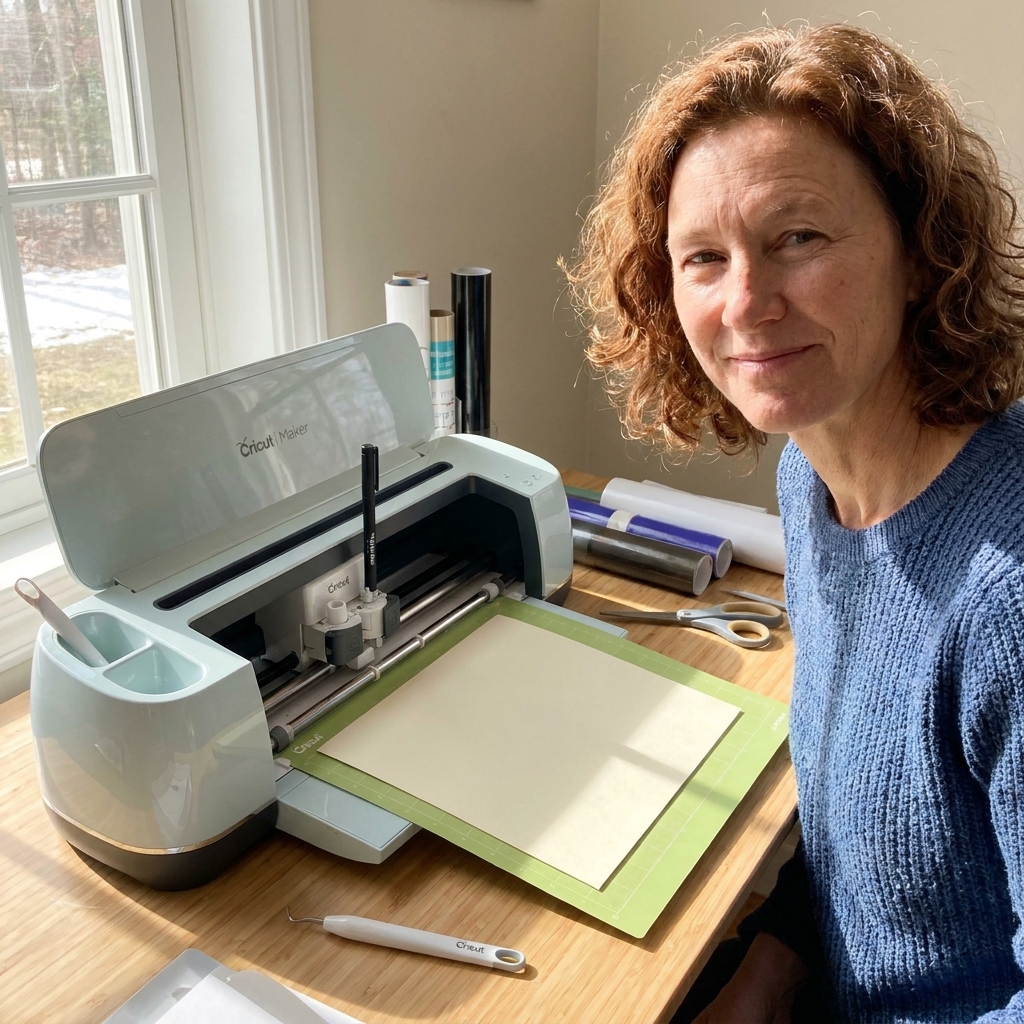
What you need (and what matters)
You can make this work with any Cricut machine that supports Draw, but pen compatibility and cardstock grip matter more than people expect.
- Cricut machine that supports Draw
- Joy: uses Joy pens and Joy-specific sizing
- Explore and Maker: use the pen clamp (commonly Clamp A)
- Venture: uses its own tool clamp system
- Pens that fit your machine (fine point is the most forgiving for small card text)
- Cardstock for the card base and ideally a separate inside panel (more on why in a minute)
- Mat that matches your paper
- LightGrip: great for most paper and lighter cardstock (less tearing)
- StandardGrip: often better for heavyweight cardstock that wants to slide
- Brayer or scraper to adhere cardstock smoothly
- Painter’s tape or washi tape (optional, but helpful for keeping small pieces flat)
- Design Space
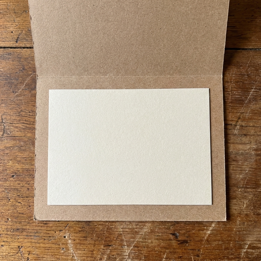
My cardstock shortcut: If your card base is textured, fibrous, or dark, add a smooth, light inside panel. Pens look sharper on smooth cardstock, and you avoid that ink-skipping-on-toothy-paper frustration.
Pick the sentiment first
This is the part that makes the inside feel human, not generated. Before you open Design Space, pick one of these three approaches.
1) One clear message
- Structure: one warm line + one specific detail
- Example: “I’m so proud of you. Watching you stick with it has been the best part.”
2) Short note plus signature space
- Structure: sentiment + “Love,” (or similar) + space to sign
- Example: “Thinking of you today and hoping it feels a little lighter. Love,”
3) Longer letter style (best on a panel)
- Structure: greeting + 3 to 5 short lines + closing
- Tip: plan line breaks intentionally so it does not become a dense block.
If you want help keeping wording intentional, my favorite mindset is to write the sentiment as if you are speaking across a table. I wrote more about that kind of clarity here: Defining intentionality for journal and bookbinding projects.
Best method: write on a panel
You can draw directly on a folded card, but the fold creates lift and uneven pressure. An inside panel gives you:
- crisper pen lines
- less risk of the mat bending your folded card
- a clean redo if you change your mind
Panel sizing: Cut a rectangle that is about 1/8 inch smaller on all sides than the inside of your folded card. That small margin looks polished and helps prevent buckling at the edges.
Design Space setup
Step 1: Set your panel size
- In Design Space, start a new project.
- Add a rectangle for your inside panel. Set its size to match the panel you plan to cut or trim.
- Lock the panel rectangle (so you do not accidentally resize it later).
Step 2: Add text and switch it to Draw
- Add a Text box and type your message.
- With the text selected, set Operation to Draw. Then choose the tool type (for example, Pen) if the menu asks.
- Choose a font that has a Writing style when possible. If the font does not have a Writing style, Cricut will usually draw outlines, which can look like bubble lettering rather than handwriting.
If you do not have a writing font: You can still get a lovely look by using larger text, increasing letter spacing slightly, and leaning into an outlined style. It reads more like modern signage than handwriting, and that can be beautiful.
One quick note on fonts: Some Writing fonts come with Cricut Access, and some are installed on your computer. Either can work as long as the font offers a Writing style in Design Space.
Step 3: Use one text box per line
For truly tidy spacing, I prefer one text box per line rather than one big paragraph. It gives you control over:
- line spacing
- intentional emphasis (a short line on its own feels meaningful)
- centering and optical balance
Then select all the lines and use Align (center or left) to make it feel deliberate.
Balance the placement
Perfectly centered sometimes feels oddly high or cramped once the card is in your hands. Here is the approach I use like a gentle typesetter:
Use a soft safe zone
- Keep text at least 1/2 inch from the edges of the panel.
- Leave more breathing room near the fold side because that area visually feels tighter.
Try a 60/40 layout
If your inside has only text, placing the sentiment slightly above the true center often looks better. Aim for:
- 60% of open space below the message
- 40% above
It subtly makes room for your signature line, even if you did not plan one at first.
Attach it (the placement fix)
This is the step that prevents Design Space from rearranging your pieces on the mat preview.
- Select the panel rectangle and all of your text layers.
- Click Attach.
Attach tells Cricut: “Keep these exactly in this relationship when you go to Make.” Without it, Design Space will optimize material use and your carefully placed sentiment may wander.
If you are newer to Cricut layout quirks, this may save you a headache: Group keeps things together on the canvas, but it does not lock mat placement. Weld changes shapes into a single layer. For keeping writing exactly where you placed it, you want Attach.
If you want the bigger picture on lettering choices, you may also like: Cricut lettering guide.
Load paper and set the pen
Step 1: Prep the mat
- Press cardstock down firmly with a brayer or scraper, especially the corners.
- If your cardstock curls, add a small piece of washi tape near the corners (not where the pen will draw).
Step 2: Install the pen firmly
Push the pen down until it is fully seated, then close the clamp. A pen that is slightly too high causes faint, skipping lines.
Step 3: Choose a smart pen color
- Black reads classic and clean.
- Dark blue feels handwritten and soft.
- Gray looks gentle for sympathy or new baby cards.
- Metallics look pretty but can be streaky on some cardstock. Test first.
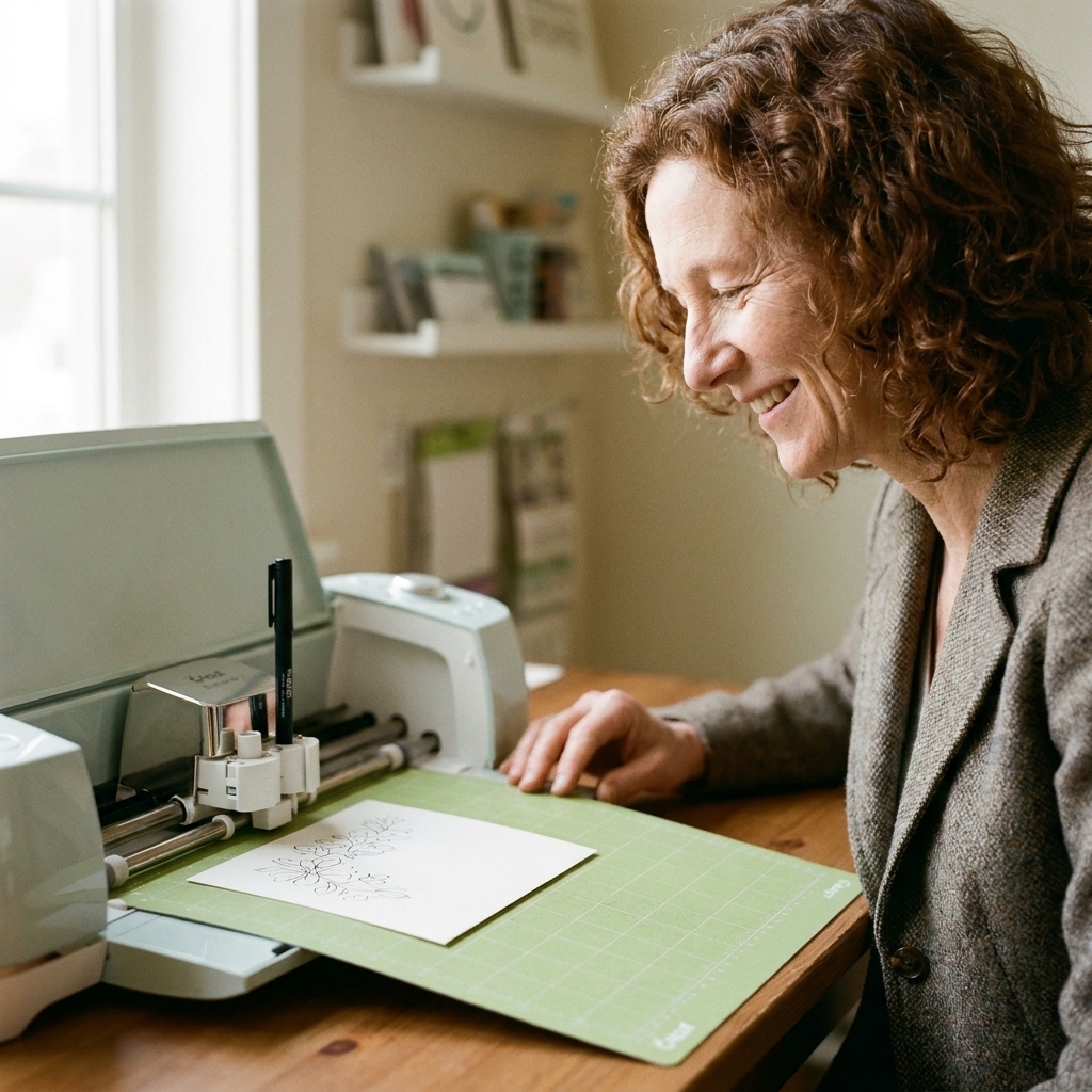
Test first
I know, I know. Testing feels like an extra step. But it is the difference between “this is sweet” and “why does the ink look patchy?”
- Use a scrap of the same cardstock.
- Draw one short line of your message at the same size.
- Check for skipping, smudging, and whether the lettering looks too thin.
If the text looks too light: Try a thicker pen, make it look bolder by increasing font size, or choose smoother cardstock.
Common gotchas
Double-check orientation
Before you hit Go, look at the mat preview and ask yourself one question: “If I glue this panel into the card exactly as it sits on my table, will the text read the right way up?” If you rotate the panel on your physical mat, rotate it in Design Space too so your placement stays predictable.
Paper grain (if your cardstock cares)
Some heavyweight cardstock has a grain direction that folds cleaner one way than the other. If you notice cracking on folds, you may want your inside panel grain to run the same direction as your card base so everything sits nicely once assembled.
Smear prevention
Gel and metallic inks can take longer to dry, and skin oils can smear fresh ink. Handle your drawn panel by the edges until it is fully dry.
If you must draw on a folded card
Open the card as flat as it will comfortably go, keep the writing area well away from the fold, and make sure the card is pressed firmly to the mat. If the fold keeps lifting, that is your cue to switch back to an inside panel.
Assemble without warping
Let ink dry
Give the inside panel a few minutes before handling, especially with gel or metallic pens.
Adhesive tips
- Use a tape runner or thin double-sided tape for an even, wrinkle-free bond.
- If you use liquid glue, apply a very thin layer and burnish from the center outward.
Place with intention
Dry fit the panel first. When it looks right, adhere it starting at the fold side and smoothing outward.
Sentiment ideas
If you want the inside to feel thoughtful, the best trick is specificity. Name the thing you noticed. Mention the moment you are honoring. Here are a few ready-to-use options you can copy into Design Space.
Birthday
- “I hope this year feels steady, bright, and truly yours.”
- “You make ordinary days better. I’m so glad you’re here.”
- “Another year of you being you, and the world is luckier for it.”
Thank you
- “Thank you for showing up the way you did. I won’t forget it.”
- “Your help mattered more than I can fit on this card.”
- “I felt supported, and that’s a rare gift. Thank you.”
Sympathy
- “I’m holding space for your grief, and for all the love underneath it.”
- “I don’t have the right words, but I’m here, and I’m not going anywhere.”
- “May the memories feel close and gentle when you need them most.”
If you are trying to choose between comforting language styles, this can help you find the tone: Sympathy vs. empathy for care packages.
New baby
- “So much love already. Welcome, little one.”
- “May your home be full of soft mornings and steady hands.”
- “You are loved beyond measure, from day one.”
For more short, stitchable sentiments that also work beautifully inside cards, you might like: Short inspirational quotes for beginner embroidery hoops.
Troubleshooting
My pen is drawing outlines
You are likely using a font that does not have a Writing style. Switch to a writing font if you have one, or embrace the outlined look by scaling up slightly.
The writing is faint or skipping
- Re-seat the pen fully in the clamp or holder.
- Use smoother cardstock.
- Try a fresh pen or a different pen type (fine point tends to be consistent).
My text is not where I placed it
Select the panel rectangle and the text, then click Attach. Without Attach, Design Space may rearrange elements on the mat.
The ink smudges when I close the card
- Let it dry longer.
- Avoid gel pens on very slick cardstock.
- Use an inside panel and keep the writing away from the fold where rubbing is most common.
The card base lifts off the mat
That is the fold fighting you. Use an inside panel, or very gently tape the card base down where the pen will not travel.
Leave a handmade gap
My favorite hybrid approach is: let Cricut draw the main sentiment, then add one truly handwritten line.
- Add: “P.S. I’m cheering for you.”
- Or: “I meant every word.”
- Or simply sign your name in your normal handwriting.
That little imperfection is reassuring. It tells the reader there was a real person on the other end of the card, choosing the words on purpose.