

I love a project that earns its keep. A coaster is already useful, already social, already living right where people set down their coffee and start talking. Add one carefully chosen word in a crisp Infusible Ink finish, and suddenly it is not just protecting your table. It is nudging the room into a better conversation.
This is one of my favorite “quiet-host” tricks from years of helping artists set up festival booths. People linger when you give them something easy to comment on. A single word does that beautifully, especially when it feels open-ended instead of preachy.
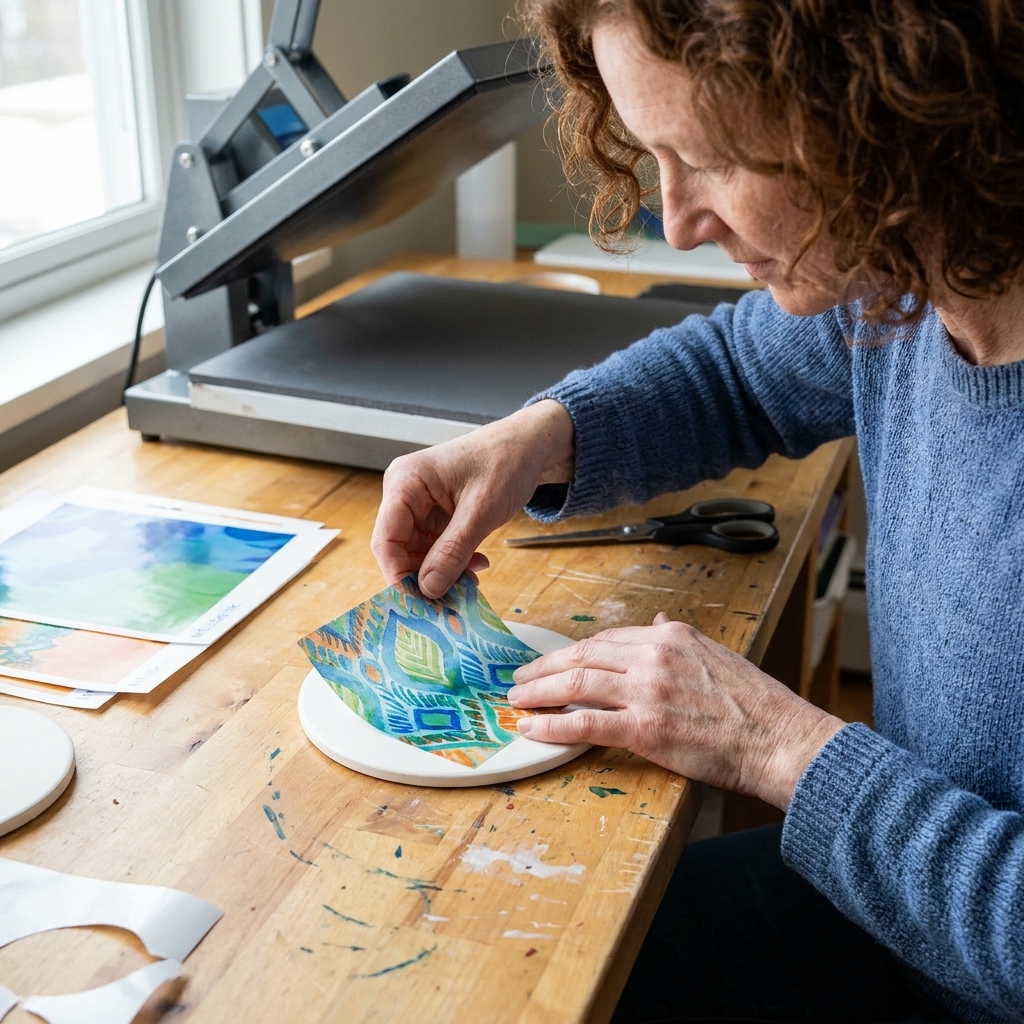
What makes a good word?
The best coaster words are readable at a glance and roomy enough to let people bring their own meaning. When I am choosing words for a small surface, I run them through four quick tests:
- It is invitational, not instructional. “Wonder” opens a door. “Be Better” feels like a chore.
- It has more than one angle. “Enough” can be about time, money, rest, confidence, or dessert.
- It suits a shared space. Your kitchen island is not a diary page. Aim for words you would happily see on a cafe table.
- It cuts and presses cleanly. Very long words and fussy scripts can look gorgeous, but on a 4-inch coaster they may lose their punch.
If you want help thinking about intentional word choice in general, you might like my piece on defining intentionality for projects. The same mindset applies here: small object, clear purpose, honest language.
35 words that spark talk
Pick one word per coaster for the cleanest look. Or build a set where the words talk to each other across the table.
Curiosity
- Wonder
- Why
- How
- Elsewhere
- Maybe
- Unlearn
- Seek
Warmth and belonging
- Welcome
- Gather
- Home
- Kind
- Neighbor
- Here
- Together
If you lean cozy, you may also enjoy words that mean home and belonging.
Perspective shift
- Enough
- Still
- Again
- Change
- Begin
- Trust
- Ease
Creative energy
- Make
- Try
- Play
- Craft
- Brave
- Idea
- Mess
For a sportier, more mantra-like vibe, see one-word mantras. The words that work on activewear often work on coasters too.
Good-natured debate
- Pineapple
- Spicy
- Brunch
- Dogs
- Books
- Coffee
- Mountains
My favorite set to gift: Wonder, Enough, Gather, Begin. They feel meaningful without feeling heavy.
Design Space text basics
Infusible Ink is a little unforgiving in a good way. It produces crisp, professional color, but it also rewards clean design choices. Here are the settings that keep single-word coasters looking intentional.
Size and layout
- Start with a margin: keep the word at least 0.25 to 0.5 inches from the edge of the coaster. This gives you breathing room and reduces the chance of lighter color near the rim.
- Use a starting size: on a typical 4-inch square coaster, I start around 1.25 to 1.8 inches tall for many fonts, then adjust until the word reads easily from arm’s length.
- Center it, then nudge on purpose: a perfectly centered word feels classic. A slightly lower placement can feel modern, as long as it is consistent across the set.
Fonts that cut and press well
For conversation-starter coasters, I prefer fonts with a clear silhouette. If you want a mix, pair a friendly serif with a simple script, but keep scripts chunky enough to survive scaling down.
- Best for readability: clean serif or sans serif with moderate stroke width.
- Use scripts carefully: choose scripts with open counters and thicker downstrokes, and avoid super thin hairlines.
- Avoid micro-details: tiny spurs and extremely thin strokes can look faint after pressing.
If you want more help with letter-shape decisions, start with my Cricut lettering guide.
Mirroring
Infusible Ink transfers need to be mirrored before cutting because you place the inked side against the coaster. In Design Space, turn on Mirror for the mat before you cut.
Infusible Ink on ceramic coasters
Infusible Ink is not sitting on top of the coaster like vinyl. Under the right heat and time, the ink turns into gas and bonds with the polymer coating on compatible blanks. That is why it looks so seamless when it is done, and why it tends to hold up so well when you use the right blanks and settings.
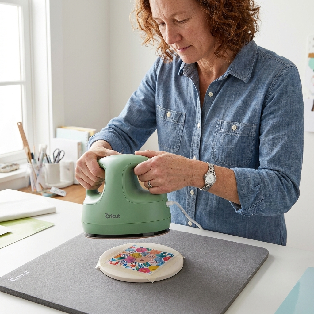
What you will need
- Poly-coated ceramic coaster blanks (Infusible Ink compatible)
- Infusible Ink transfer sheet, or Infusible Ink pens and laser copy paper (Cricut’s common recommendation for marker transfers)
- Cricut cutting machine and StandardGrip mat
- Heat source approved for Infusible Ink (commonly an EasyPress)
- Heat-resistant tape
- Lint roller
- Butcher paper (plain, uncoated)
- Heat-safe surface and pressing mat
- Optional but helpful: heat-resistant gloves
Step-by-step
- Prepare the coaster surface. Lint roll the top thoroughly. Ceramic picks up tiny fibers that can turn into little blue specks or hazy spots when heated.
- Cut your word. Place the transfer sheet ink-side up on the mat, set the correct material, and remember to mirror your design. After cutting, weed away the excess transfer sheet so only the word remains.
- Trim and position. Trim close to the word so you are not heating extra inked areas. Place the word ink-side down on the coaster and tape it firmly with heat-resistant tape. Make sure it cannot shift.
- Set up your press safely. Use butcher paper above and below as recommended for your heat setup. Some blanks call for preheating and some do not, so treat preheating as a settings-dependent step, not a universal one. Work in a well-ventilated area and keep hands clear of the heated blank.
- Press with steady pressure. Apply heat for the time and temperature specified for your coaster blank and heat press combination. Hold steady. No sliding. No peeking.
- Cool, then reveal. Let the coaster cool enough to handle, then remove the tape and paper. The result should look smooth and embedded into the surface, with the sheen depending on your specific blank (glossy, satin, or matte).
Where to find the exact time and temp: use the settings for your specific blank and heat press. Cricut keeps these in their Heat Guide, which is the safest place to confirm current recommendations: https://cricut.com/heatguide.
Common problems and fixes
Faded or uneven color
- Cause: not enough heat or time, poor contact, or moisture in the blank.
- Fix: confirm the recommended settings, follow any preheat guidance for your specific blank, and make sure the press is centered with even pressure.
Ghosting or a shadow
- Cause: the transfer shifted during pressing or during removal while still hot.
- Fix: tape more securely, use only heat-resistant tape, and let it cool before moving or peeling.
Tiny blue specks
- Cause: lint or dust on the coaster surface.
- Fix: lint roll like you mean it, even if the coaster looks clean.
Color outside the word
- Cause: stray ink areas on the transfer sheet or handling the inked side too much.
- Fix: trim close, keep fingers off inked areas, and avoid excess transfer sheet around the design.
Make a set on purpose
If you are making multiple coasters, cohesion matters. The easiest way to make the set look designed is to set rules and stick to them.
- One font family across the whole set (even if you vary weight).
- One layout rule (centered, or consistently lower-third, and so on).
- One color story (all warm tones, all cool tones, or a tight palette of 2 to 3 shades).
- Words that relate (a curiosity set, a cozy set, a playful food-debate set).
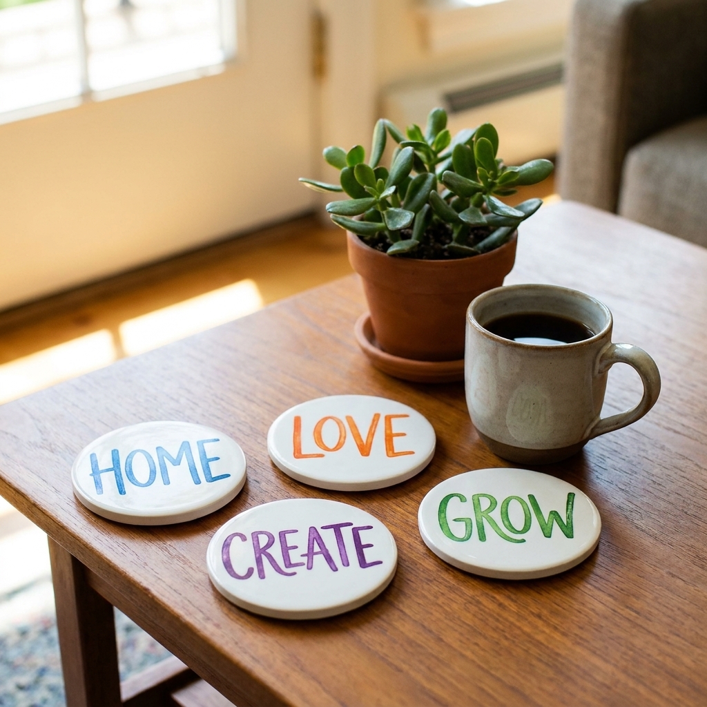
If you want your finished coasters to feel like more than a craft, I wrote about the tiny details that make something feel lasting in what makes a keepsake.
Quick FAQ
Do Infusible Ink coasters last?
On compatible poly-coated ceramic blanks, the ink becomes part of the coating rather than sitting on top. That makes it very durable and resistant to peeling like vinyl can. Like any heat transfer, results depend on using compatible blanks and the correct heat settings.
Can I use any ceramic tile?
Not for Infusible Ink. You need a surface that is specifically coated for sublimation-style transfers, often sold as Infusible Ink compatible or sublimation-ready.
How do I clean them?
For everyday care, I treat them like a nice mug: wipe clean, avoid abrasive scrubbers, and follow the coaster blank maker’s care guidance if it came with one.
Is one word really enough?
Yes. One word is often better because it leaves conversational space. If you want longer text, choose a short phrase and keep it legible. For longer projects, I share formatting tips in hand-lettering long quotes on A5 covers.