

I love word art that actually means something, not just something that fills a blank space on the wall. One of my favorite Cricut tricks for that is the knockout text technique: you let a set of values like Kindness, Curiosity, or Show up literally cut through a family last name. The result is graphic, readable, and surprisingly timeless, especially when you keep the typography intentional.
This tutorial walks you through building the design in Cricut Design Space so you can cut it in vinyl, HTV, cardstock, or even as a stencil for paint.
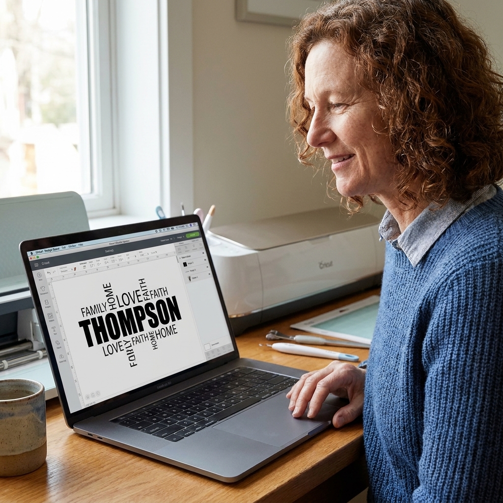
What knockout text means
A knockout design is when the smaller words are not just placed on top, they are punched out of the larger word. In Design Space, that usually means:
- You build a solid base shape, often a bold last name.
- You place your value words on top where you want them to intersect.
- You turn the value words into cutout holes using Slice (or, depending on your version of Design Space and font choices, a combine style tool plus a workaround).
If you cut the finished piece from vinyl, the value words become the negative space. If you cut it from cardstock, the value words become literal openings you can back with another color.
Before you start: pick value words that read well
This technique rewards short, strong phrasing. If your values are too long, you end up shrinking them until they look like a password.
My favorite formats for value words
- Single nouns: Respect, Grace, Courage, Wonder
- Short verbs: Listen, Learn, Forgive, Begin
- Two word promises: Be kind, Stay curious, Tell truth, Choose joy
If you want inspiration that leans warm and homey, my list of words that mean home and belonging can help you find values that feel lived-in, not corporate.
How many value words should you use?
For most last names, 5 to 9 value words is the sweet spot. Fewer can look sparse. Too many turns into visual noise and makes weeding harder.
Materials that work well
You can build the same file and cut it in different ways. Here is what tends to be the least frustrating.
- Permanent vinyl on a sign: crisp knockout, clean look, easy to scale.
- HTV on a shirt or tote: great if the last name is thick and the value words are not tiny. Remember that true knockout means the shirt color shows through the cutouts, and you will typically need to mirror your mat before cutting.
- Cardstock layered art: beautiful contrast if you back the cutouts with a second color. Lightweight glue or a fine adhesive runner keeps it flat, and foam tape behind the backing layer adds depth if you want it.
- Stencil for paint: bold and rustic, especially on wood. If you want inner shapes (like the center of an O or A) to stay in place, you will need bridges or you will lose those little islands when you weed the stencil.
If you are planning to paint through a stencil, you may also like my walkthrough on Cricut stencils, since many of the same bridge and spacing ideas apply.
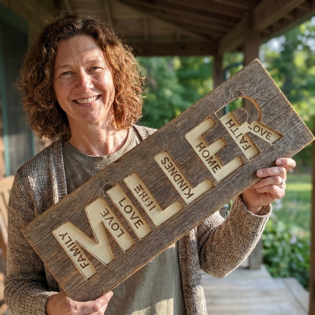
Design Space tutorial: knockout family values in 10 steps
This is the core workflow I use when I want the value words to become true cutouts in the last name.
1) Start with a bold last name
- Open Cricut Design Space and choose New Project.
- Click Text and type the last name.
- In the font menu, choose a bold, simple, sans serif style for your base. Thick strokes give your cutouts room to breathe.
If you are unsure how to make letter spacing behave, my Cricut lettering guide covers the common spacing and alignment headaches.
2) Turn the last name into one clean shape
With the last name selected:
- If it is a script font, adjust Letter Spacing so letters touch naturally.
- If the letters overlap (or you want the name to behave as one piece), click Weld to make the name a single shape.
Note: If your base font is already a solid, non-overlapping block style, you may not need to weld. The goal is simply to have a base that slices cleanly and cuts as you expect.
3) Duplicate the base name (trust me)
Make one copy of your base name and set it aside off the canvas.
Why: Slice produces new result layers. Keeping a clean backup saves you from rebuilding if you change your mind about placement or sizing.
4) Add your value words
- Click Text for each value word or short phrase.
- Choose a font that contrasts with the base name. A narrow sans serif or a neat serif often reads best at small sizes.
- Keep them mostly horizontal at first. You can tilt a couple later for energy.
A good rule: if your last name is bold and blocky, choose value words that are clean and straightforward, not ornate.
5) Size value words for readability
Zoom out and ask one question: can you read each value word from the distance your finished piece will be seen?
- For a 10 to 12 inch sign, tiny value words can become weeding confetti.
- For a 3 foot porch sign, you can go more delicate.
6) Place value words across the last name, then check structure
Drag each value word so it overlaps the last name where you want the knockout to happen.
Structural check: avoid placing cutouts that leave skinny islands of the last name that will tear or lift. Watch out around letters like A, E, R, and S where thin joins happen naturally.
7) Make sure everything is Basic Cut
Select a value word and confirm it is set to Basic Cut. Do the same for the last name.
If any part is set to Draw, Print Then Cut, or another operation, Slice can be unavailable.
8) Slice one value word at a time
Slice works best two layers at a time: select the base name and one value word.
- Select the base name and one value word.
- Click Slice.
- After slicing, you will see multiple new layers. Move them slightly apart so you can see the results.
- Keep the base-name layer that now shows the missing word as a hole.
- Delete the word-shaped slice results and any extra pieces you do not need.
Repeat for each value word, always slicing the updated base name with the next value word.
9) Clean up, then Attach if you need placement locked
When all value words have been knocked out:
- Delete any leftover scrap shapes created by Slice.
- Select the final base name shape and click Attach if you are cutting alongside other elements and want it to stay positioned on the mat.
Attach keeps your layout together for cutting. It does not merge shapes the way Weld does.
10) Do a weeding preview before you hit Make It
This is my favorite sanity check: zoom in and imagine your weeding tool moving through every cut line. If you see a lot of tiny enclosed shapes (like the inside of an e, a, or o) sitting next to tiny value letters, consider simplifying.
Design choices that feel intentional
Pair one bold font with one calm font
The most classic knockout look is a heavy base font for the last name plus a simpler, narrower font for the value words. If you want more guidance on mixing styles without it feeling chaotic, my post on pairing fonts in Cricut Design Space is written for vows, but the logic translates beautifully to family designs.
Use value words that sound like your household
I have helped artists write about their work for years, and the same principle applies here: the best words are the ones you will still recognize as true in five years.
- If your family culture is playful, pick values like Laugh often or Stay curious.
- If it is steady and grounded, try Keep promises, Do the work, or Be brave.
Build in breathing room
Leave some untouched space in the last name. When every inch is carved up, the eye cannot rest and the name loses its presence.
Troubleshooting
Slice is grayed out
- You selected too many layers. Select only the base name and one value word.
- One item is not set to Basic Cut.
- Your base is not behaving like a single shape. Try welding overlapping letters, or otherwise converting the text into a single cuttable layer so Slice has a clean base to work with.
My last name falls apart after slicing
- Your base font is too thin. Choose a heavier font for the last name.
- Your value words are too large or placed on fragile parts of letters.
- Too many cutouts too close together. Spread them out or reduce the count.
Weeding is a nightmare
- Make the value-word font thicker or slightly larger.
- Reduce the number of value words.
- Switch materials: cardstock or paint stenciling can be easier than tiny vinyl weeding.
My stencil loses the centers of letters
That is normal with stencils. The inner parts of letters like O, A, B, D, and R are separate islands, so they will lift out unless you design bridges to hold them in place. If you do not want bridges, choose a stencil-friendly font or redesign those words so you are not relying on tiny counters.
I want the value words to stay on top in a different color
That is not a knockout. That is layered typography. Skip Slice and instead:
- Keep the base name as one piece.
- Keep value words as separate cut layers.
- Use Attach for placement and cut them in different colors.
Value word ideas you can use
If you want a quick starting set, here are value words that tend to fit well into knockout designs because they are short and punchy.
Warm and home-centered
- Welcome
- Gather
- Grace
- Belong
- Comfort
- Care well
Character and integrity
- Be honest
- Keep promises
- Respect
- Choose kind
- Do right
- Own it
Curiosity and growth
- Keep learning
- Try again
- Stay curious
- Practice
- Be brave
- Begin
If you want more word lists that feel maker-friendly, you can browse Word Meanings or skim my thoughts on intentionality in creative projects for a mindset reset before you commit the words to a permanent sign.
Quick checklist before you cut
- Base name is a clean shape and thick enough to survive cutouts.
- Value words are readable at the final physical size.
- Slice was done one word at a time and extra result pieces are deleted.
- Fragile letter areas are not overly carved up.
- You like the words not just how they look.
That last one sounds obvious, but it is the heart of the technique. When the values are true, the design feels like a family story, not just decor.