

My favorite kind of organization is the kind you can feel in your shoulders. Not “perfect pantry” energy. More like, you open a cabinet, find what you need, and your brain gets to stop scanning for a second.
That is what mindful pantry labels can do when you choose the right words and make them easy to read. Cricut Joy is especially good for this because it is quick for small batches, easy to keep on the counter, and (with Smart Vinyl) you can cut without a mat. One calm evening, a few feet of Smart Vinyl, and suddenly your staples have homes you can name.
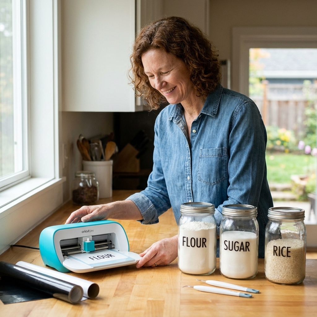
Mindful labels start with calm words
Before you open Design Space, take two minutes to decide what kind of language you want in your kitchen. This is not just aesthetics. The label words you see every day quietly guide your attention.
What makes a label feel calming?
- Familiar: Words you would actually say out loud when cooking.
- Specific enough: Not so broad that the bin becomes a junk drawer.
- Gently neutral: Less “rules,” more “home.”
- Consistent: One style of word choice across the pantry so nothing feels loud.
If you like the idea of labels that feel homey instead of clinical, you might also enjoy the vocabulary list in 12 Words That Mean Home and Belonging. Those kinds of words can guide the tone of your category names even if you keep the labels simple.
Calm category sets you can copy
Pick one “voice” and stick with it.
Option A: Simple pantry nouns
- Baking
- Breakfast
- Pasta
- Rice
- Snacks
- Tea
- Spices
- Oils
Option B: Softer groupings
- Everyday Grains
- Quick Meals
- Cozy Baking
- Little Treats
- Warm Drinks
- Soup Starters
- Simple Snacks
- Weeknight Helpers
If you are wondering what “Weeknight Helpers” might mean in real life, think: jarred sauce, boxed broth, tortillas, canned beans, and that one spice blend you reach for when you are tired.
Option C: Use-based labels
- Grab and Go
- Lunchbox
- Weekend Baking
- One Pot
- Pantry Staples
- Backstock
- Open First
Mindful note: if a label carries guilt, it is going to spike stress instead of lowering it. I skip labels like “Healthy” or “Cheat” in shared household spaces. Food does not need moral categories to be organized.
A quick word audit
If you want labels to stay useful, name categories based on how you actually live, not how you shop on your best day.
Ask these three questions
- Where would I look first? Your label should match your instinct.
- What causes the most rummaging? Label those areas before the pretty ones.
- What changes seasonally? If it changes a lot, label the container type (like “Backstock”) instead of a specific item.
Swap vague for findable
- “Misc” → “Packets” or “Baking Add-Ins”
- “Grains” → “Rice” and “Oats” (separate if you buy both regularly)
- “Meals” → “Quick Meals” or “Pasta Night”
- “Snacks” → “Sweet Snacks” and “Salty Snacks”
If you like this kind of intentional naming, you will feel right at home with how I talk about clarity in Defining Intentionality for Journal and Bookbinding Projects. Different craft, same mindset: words shape the experience.
Measure once, label calmly
The sizing part is what makes labels feel effortless later. Two jars can look the same until you try to place a label over a seam or a curve.
Step 1: Choose your label surface
Decide where the label will live, because that determines everything else.
- Flat bin fronts: easiest to weed and apply, most readable from a distance.
- Jar bodies: works best on straight-sided containers.
- Jar lids: great for quick scanning from above, but smaller text.
- Shelf edge: calm and minimalist, but you must keep items in consistent spots.
Step 2: Capture three measurements
- Available width: the flat area you can actually use, not the full jar circumference.
- Available height: leave breathing room above and below so the label does not look cramped.
- Viewing distance: across the kitchen or right in front of your face.
A simple method: put painter’s tape on the container where you want the label, mark the usable rectangle, then measure the tape. That rectangle is your real design space.
Starting sizes for readable labels
These are starting ranges I have found workable for pantry labels. Font choice matters a lot here. Thin serifs and tight scripts need more size than a simple sans serif, and tiny letters always take more patience to weed.
- Small jars (spices, baking powder): about 0.35 to 0.6 in letter height.
- Medium containers (1 to 2 quart jars): about 0.6 to 0.9 in letter height.
- Large bins (flour, cereal, snacks): about 0.9 to 1.5 in letter height.
Those ranges keep weeding reasonable and readability high. Cricut Joy can cut small text, but calm labels usually look better when they are not whisper-thin.
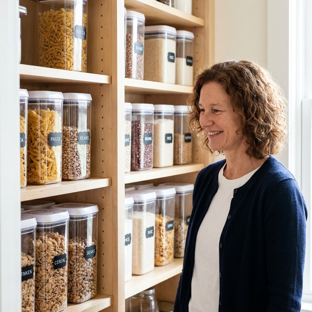
Materials that keep it easy
Cricut Joy is happiest with simple, consistent materials. Here is the low-stress setup I recommend for pantry labeling.
Vinyl choices
- Permanent vinyl: best for plastic bins and jars you do not plan to relabel often.
- Removable vinyl: better for categories that change, like “Lunchbox” or “Backstock.”
- Smart Vinyl: convenient for Joy because it feeds without a cutting mat. Great for batches.
If you are using regular vinyl (not Smart Vinyl), plan on using a mat with Cricut Joy. That is still calm, just one more step.
Transfer tape notes
If your labels are single words, standard transfer tape works smoothly. For tiny letters, I prefer a gentler touch: burnish lightly, peel slowly, and do not rush corners. Calm application is part of the point.
Container finish matters
- Very textured plastic: vinyl can lift at the edges. Consider labeling the bin front with a smoother label panel, or use a smooth container.
- Powder-coated canisters: usually fine, but clean well first.
- Glass: easy and forgiving, especially straight-sided jars.
Design Space setup
Design choices can either lower the visual noise or add to it. The good news is that a calm label is usually a simple one.
Font and spacing tips
- Pick one font family for the whole pantry. Two fonts can work, but only if there is a clear job separation (like serif for categories, sans for subcategories).
- Prioritize readability over personality. If you love script, use it for a few larger categories and keep most labels in a clean sans serif.
- Add letter spacing for small text. Slightly more spacing weeds easier and reads better.
- Avoid all caps if it feels shouty to you. Title case often reads softer.
If you enjoy dialing in type pairings, I wrote a deeper guide to balanced font mixing here: Pairing Script and Serif Fonts for Wedding Vow Keepsakes in Cricut Design Space. The examples are wedding-focused, but the principles carry straight into kitchen labels.
Make a label system
Create one label file with repeated text boxes sized to your standard label width. Duplicate a label, change the word, keep everything else identical. It is the fastest way to end up with a pantry that looks intentional without feeling obsessive.
Cutting with Cricut Joy
- Batch your words. Write every category name in one sitting. Fewer decisions later.
- Standardize sizes. Choose 1 or 2 label sizes max (small jars, large bins).
- Load Smart Vinyl carefully. Trim a straight edge so Joy feeds cleanly.
- Do a small test cut. Especially if your text is under 0.5 inches tall or you are using a delicate font.
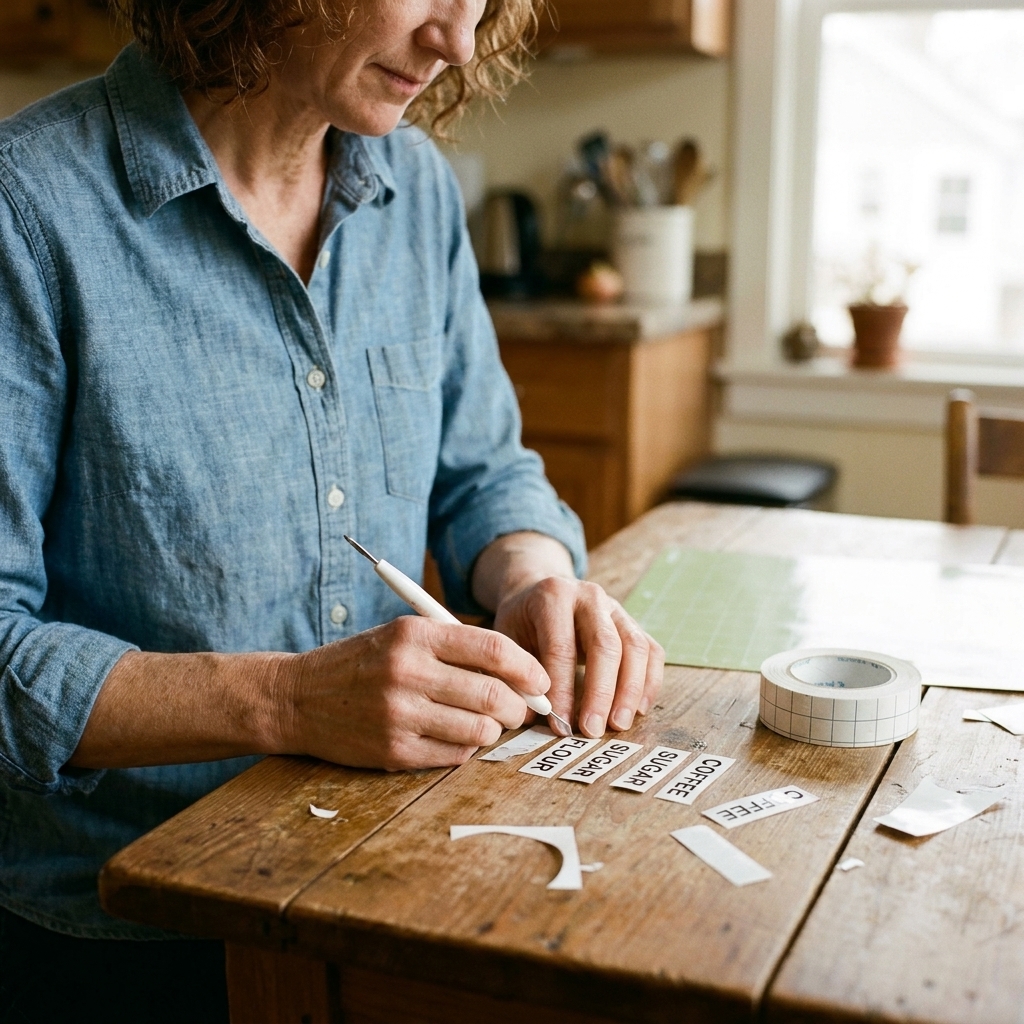
- Weed slowly. Put on a song. This is the mindful part.
- Apply with a hinge. Use a strip of painter’s tape to hold the transfer tape in place along one edge, check alignment, then flip the label up like a little door to remove the backing and lay it back down.
- Burnish gently. Focus on letter edges.
Three small details that prevent most label frustration:
- Let freshly washed containers fully dry. Water residue is sneaky.
- Degrease first. A quick wipe with rubbing alcohol often helps vinyl stick, but test on an inconspicuous spot and avoid plastics or finishes that can haze or discolor. Let it fully evaporate before applying vinyl.
- Give it time. After you apply permanent vinyl, try not to scrub or soak that area right away. A little rest time helps the adhesive settle.
Wording ideas for real pantries
Here are a few category names that tend to reduce clutter without feeling strict. Use as-is, or treat them like prompts.
For tiny packets
- Packets
- Drink Mix
- Seasoning Packets
- Lunchbox Extras
For calm baking
- Baking Basics
- Baking Add-Ins
- Sweeteners
- Decorating
For snacks without chaos
- Sweet Snacks
- Salty Snacks
- After School
- Quick Bites
For backstock
- Backstock
- Refills
- Open First
- Extras
Care and updates
Cleaning labeled containers
I treat labeled areas gently. A soft cloth, mild soap, and no aggressive scrubbing directly on the edges keeps corners from lifting. If a container needs a deep clean, I would rather soak it and wipe around the label than attack the label itself.
Removing and replacing labels
If your system changes, that is allowed. To remove vinyl, warm it first (a little heat helps), then peel slowly. If any residue is left behind, use a small amount of gentle adhesive remover and spot test first, especially on plastic. Then wash, dry fully, and relabel when the surface feels clean and calm again.
Readability and accessibility
Calm is also readable. High contrast (black on clear, white on dark bins) lowers effort. I also avoid ultra-thin fonts for pantries, especially if anyone in your home has lower vision. Slightly larger text, a little more spacing, and a clean sans serif can make the whole kitchen feel friendlier.
FAQ
How small can Cricut Joy cut label text?
It can cut surprisingly small, but for pantry labels I aim for comfort. Around 0.35 inches letter height is a practical lower starting point for simple sans serif text. If you go smaller, use a very clean font, add a touch of letter spacing, and expect slower weeding.
Should I label ingredients or categories?
If you decant into jars, ingredient labels (Flour, Sugar, Oats) are perfect. For bins and shelves, category labels (Baking Basics, Snacks, Backstock) usually stay useful longer because the contents shift.
How do I keep labels from looking busy?
Use fewer words, not fancier fonts. One or two words per label, one font family, consistent case (Title Case or lowercase), and plenty of blank space around the text.
What if I want cozy, not minimalist?
Cozy and calm can absolutely coexist. You can choose warmer category words (Cozy Baking, Warm Drinks) while keeping the typography clean. If “cozy” is part of your home language, you might enjoy my exploration of what that feeling actually means in The True Meaning of Hygge.
A small closing thought
Labeling is not about control. It is about giving your future self fewer tiny decisions. If you choose words that sound like your home and sizes that are easy to read, your pantry stops being a problem to solve and starts being a place that quietly supports you.